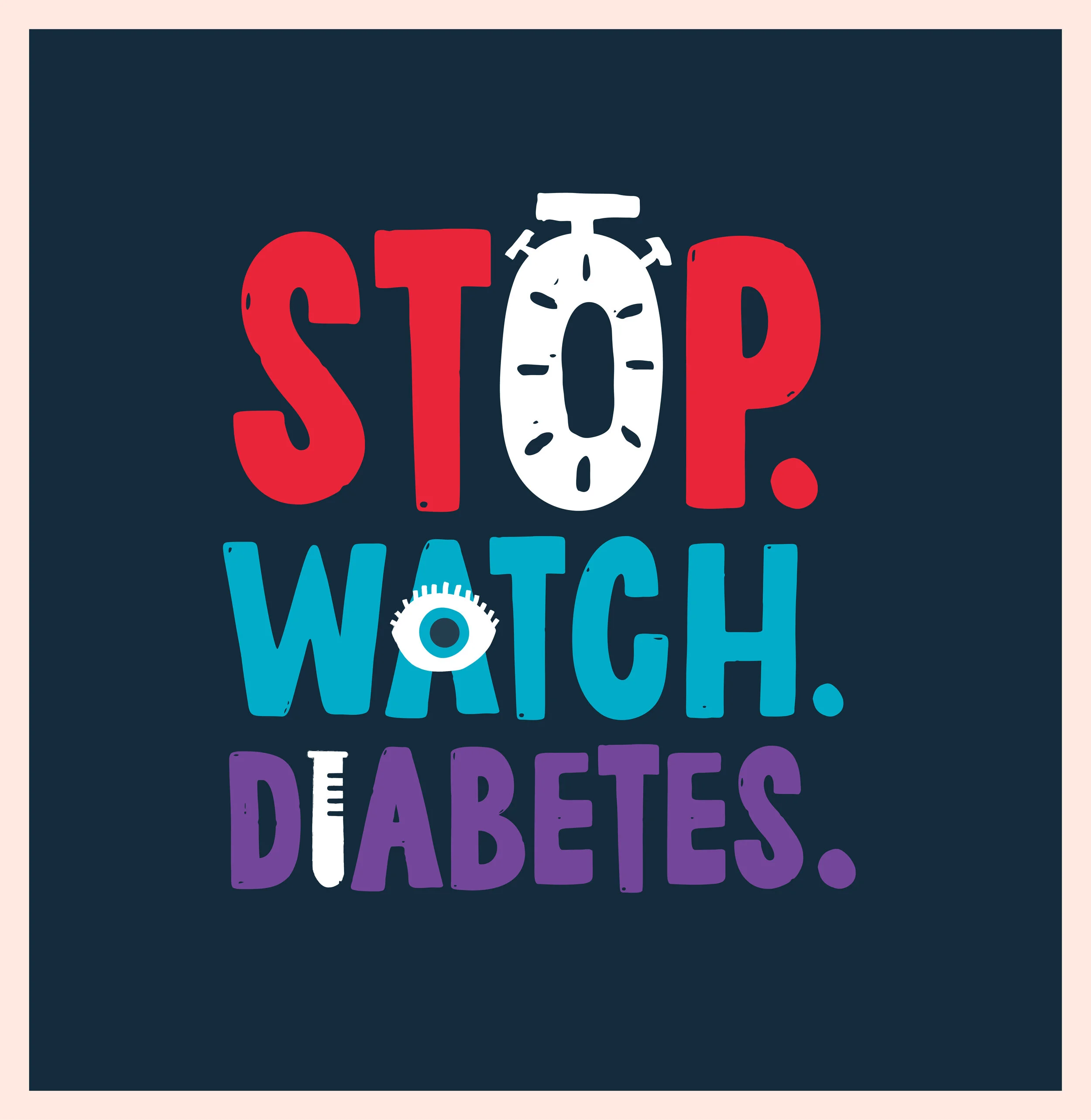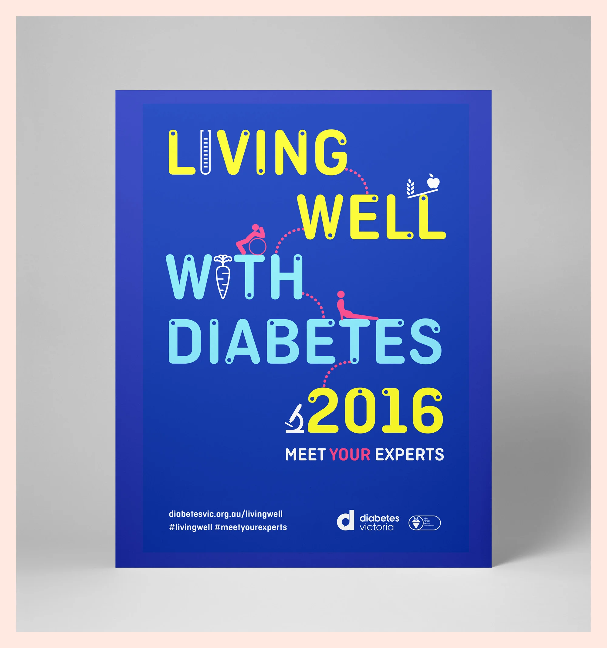
Design of creative and rollout for the 2022 Diabetes Symposium.
Mini Mega Model Museum current exhibition at Melbourne Museum. Exhibition design (Studio Mether) and Graphic design (Studio Tweed).
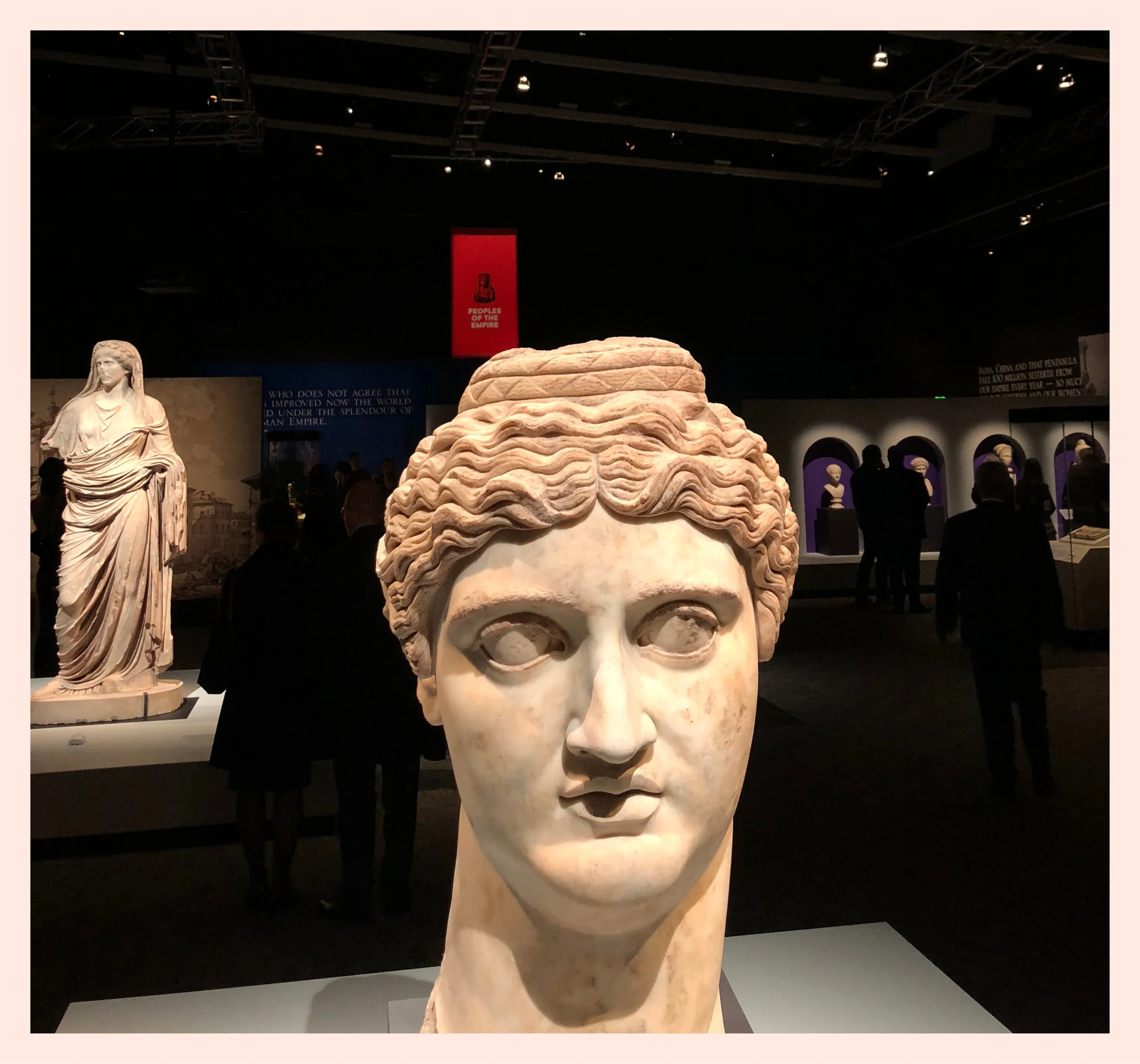
Graphic design for the exhibition Rome: City and Empire showing at National Museum of Australia (Canberra). Worked collaboratively with Studio Mether who did the exhibition design.
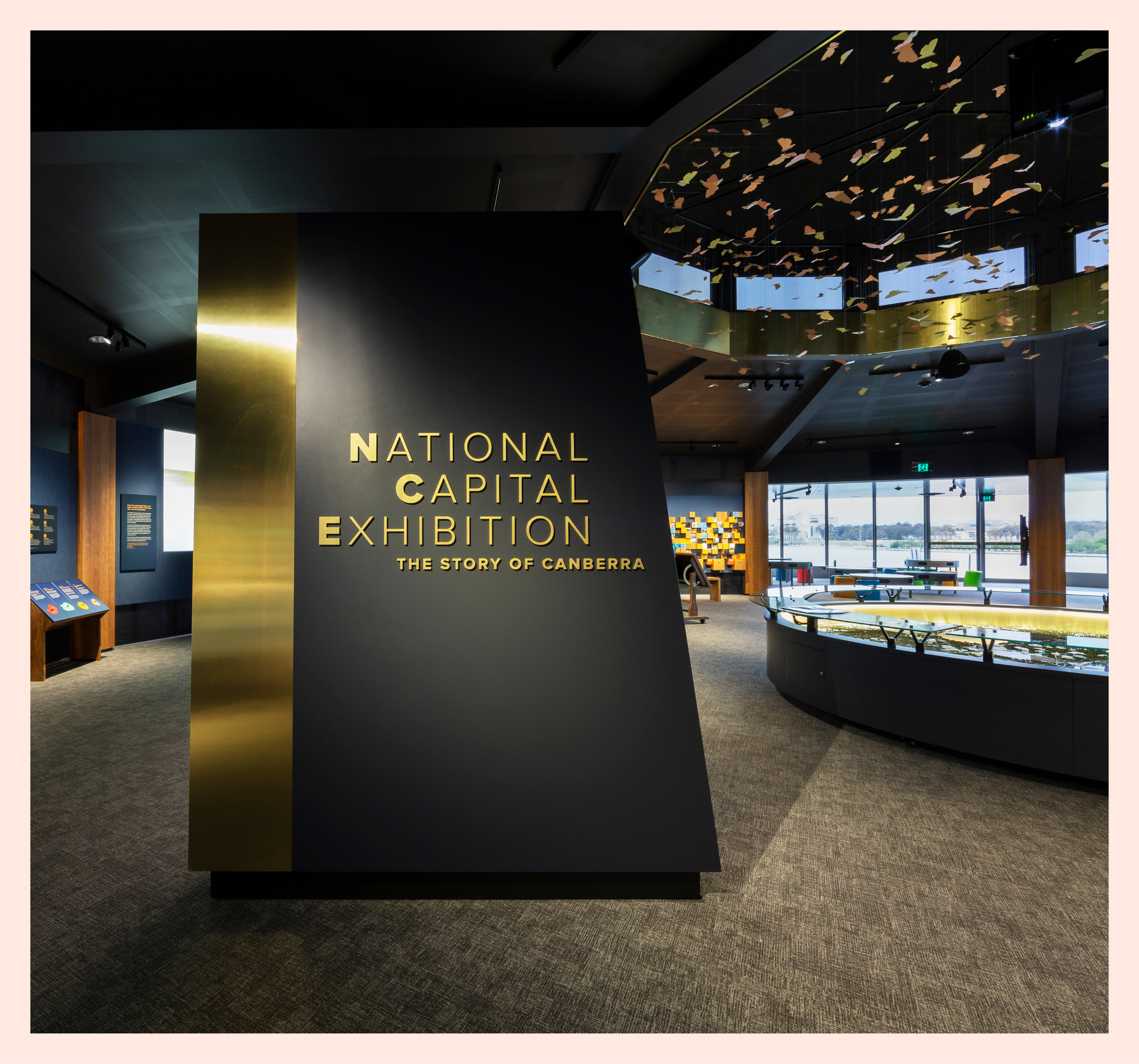
This permanent exhibition tells the story of Canberra as the capital city of Australia. Responsible for the graphic design and collaborating with the talented Studio Mether (exhibition design) and talented Dr Toni Roberts (research and curator).
Logo design for The Kirkman Group.
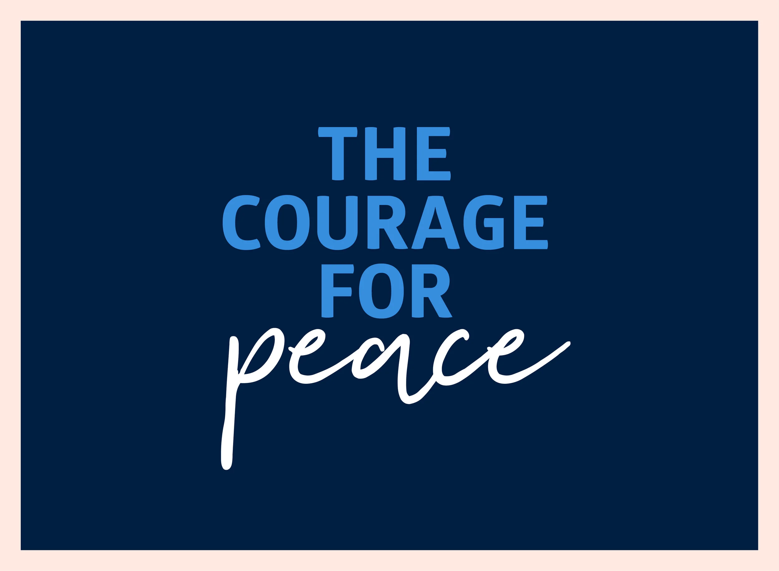
Exhibition design (Studio Mether) and graphic design (Studio Tweed). The Course for Peace exhibition at Australian War Memorial, Canberra.
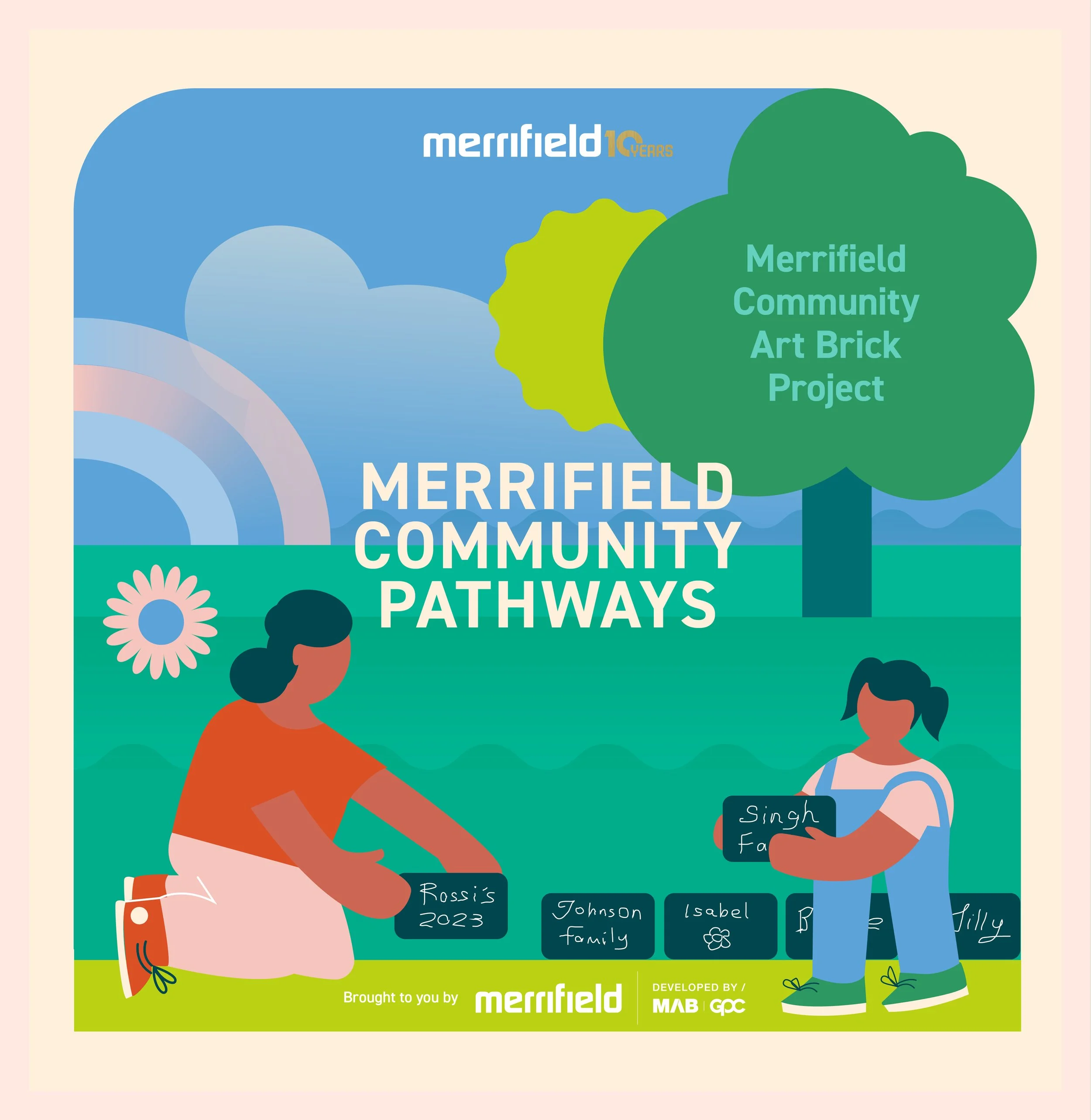
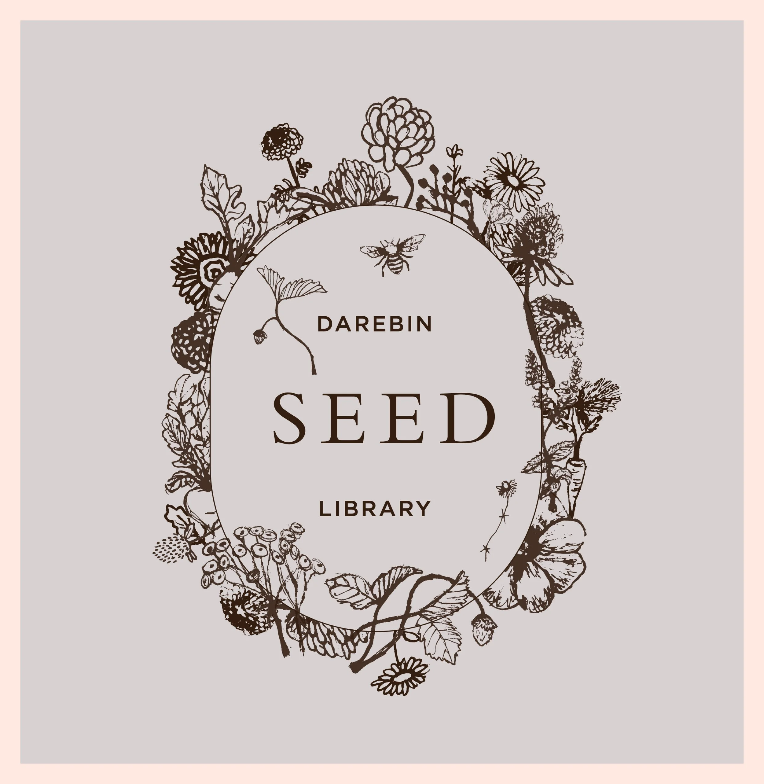
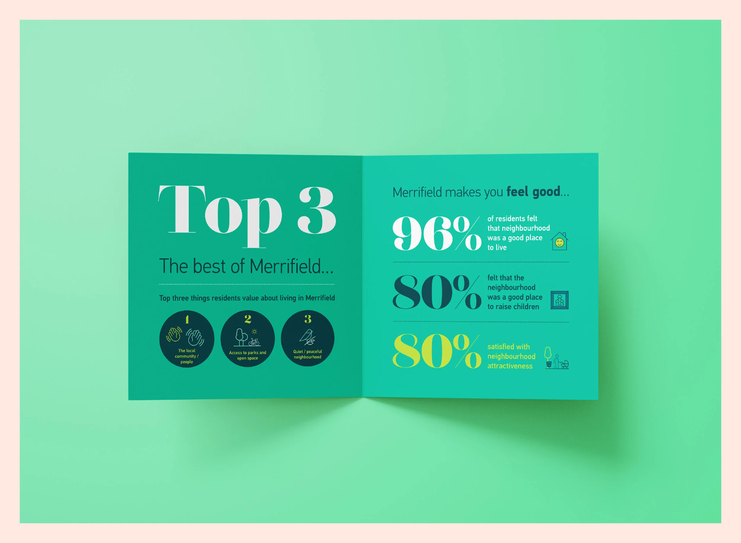
Merrifield social tiles.
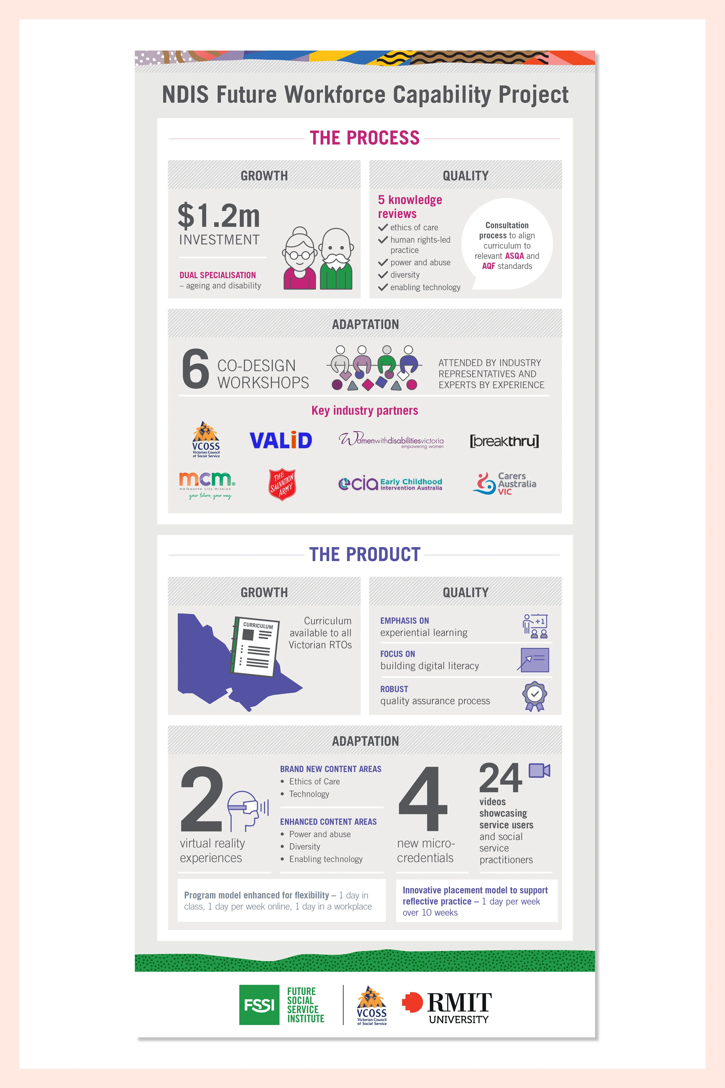
Future Social Service Institute design, print & install of interior graphics.
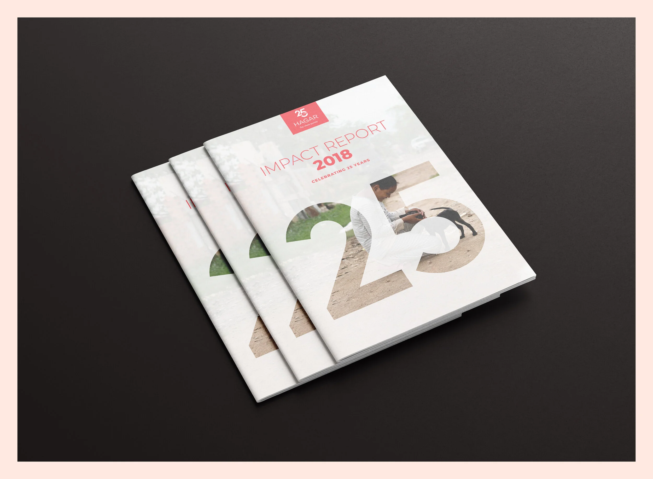
Hagar Impact Report, 25 years.
Illustration and design.
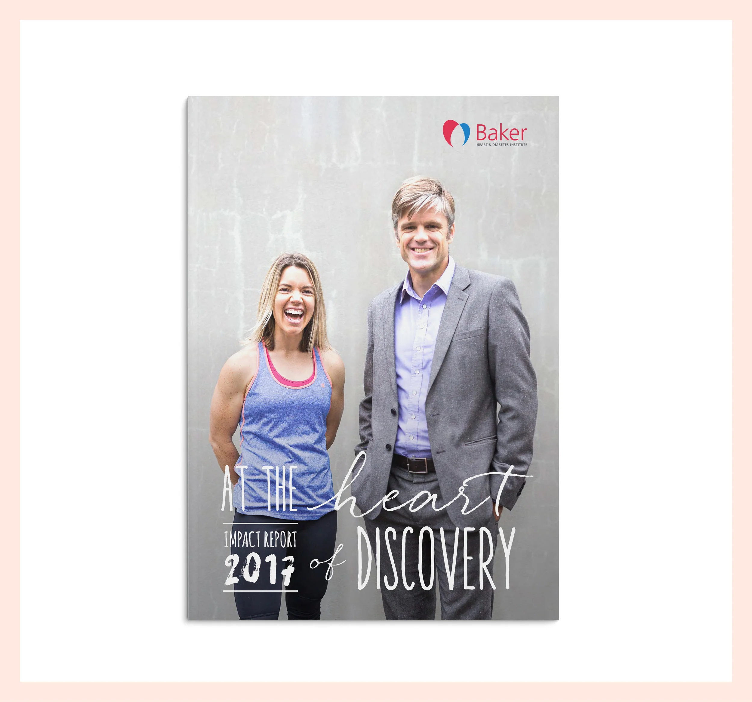
Cardiovascular disease report No Second Chances.
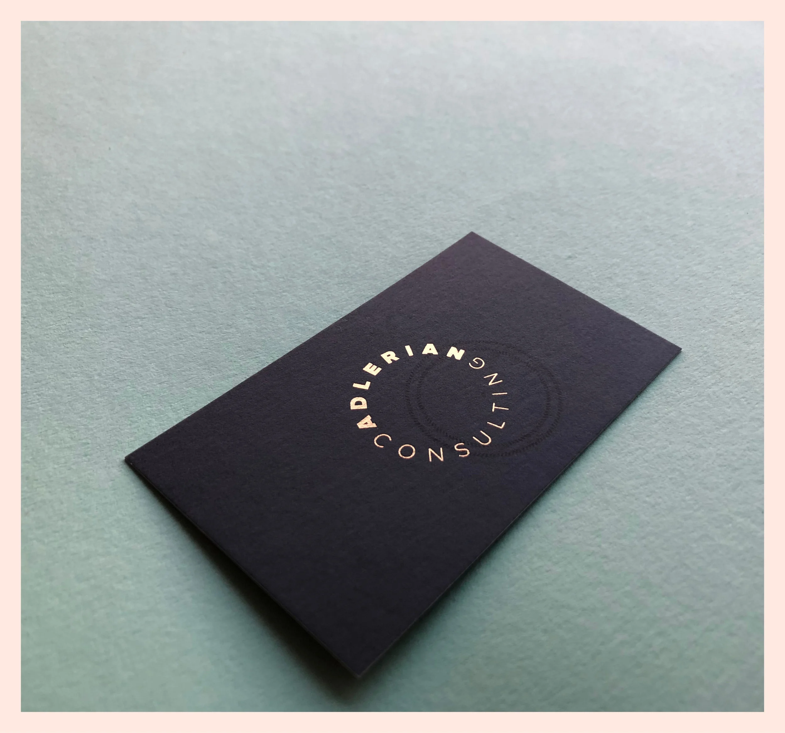
Logo and visual identity design for Adlerian Consulting.
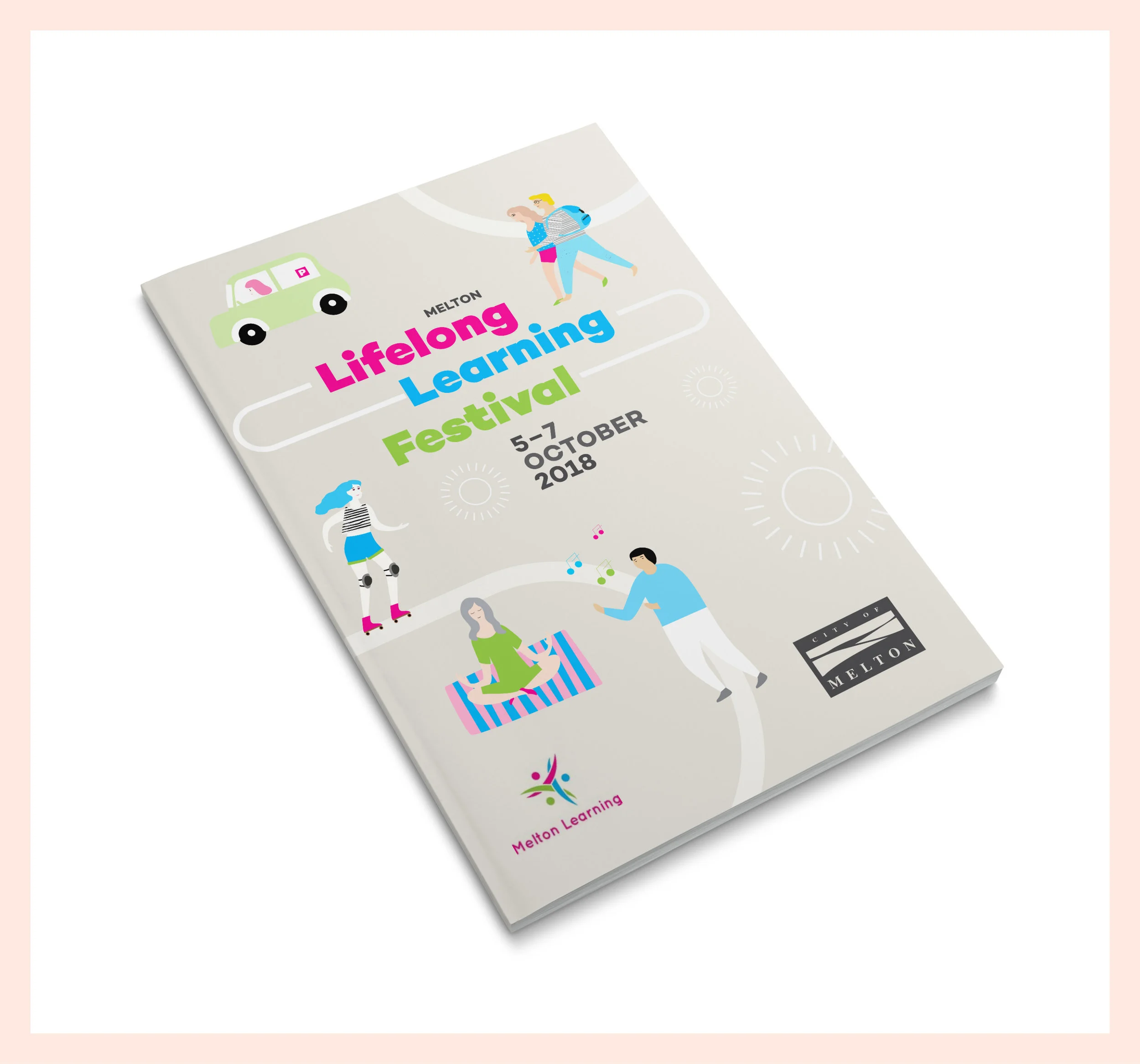
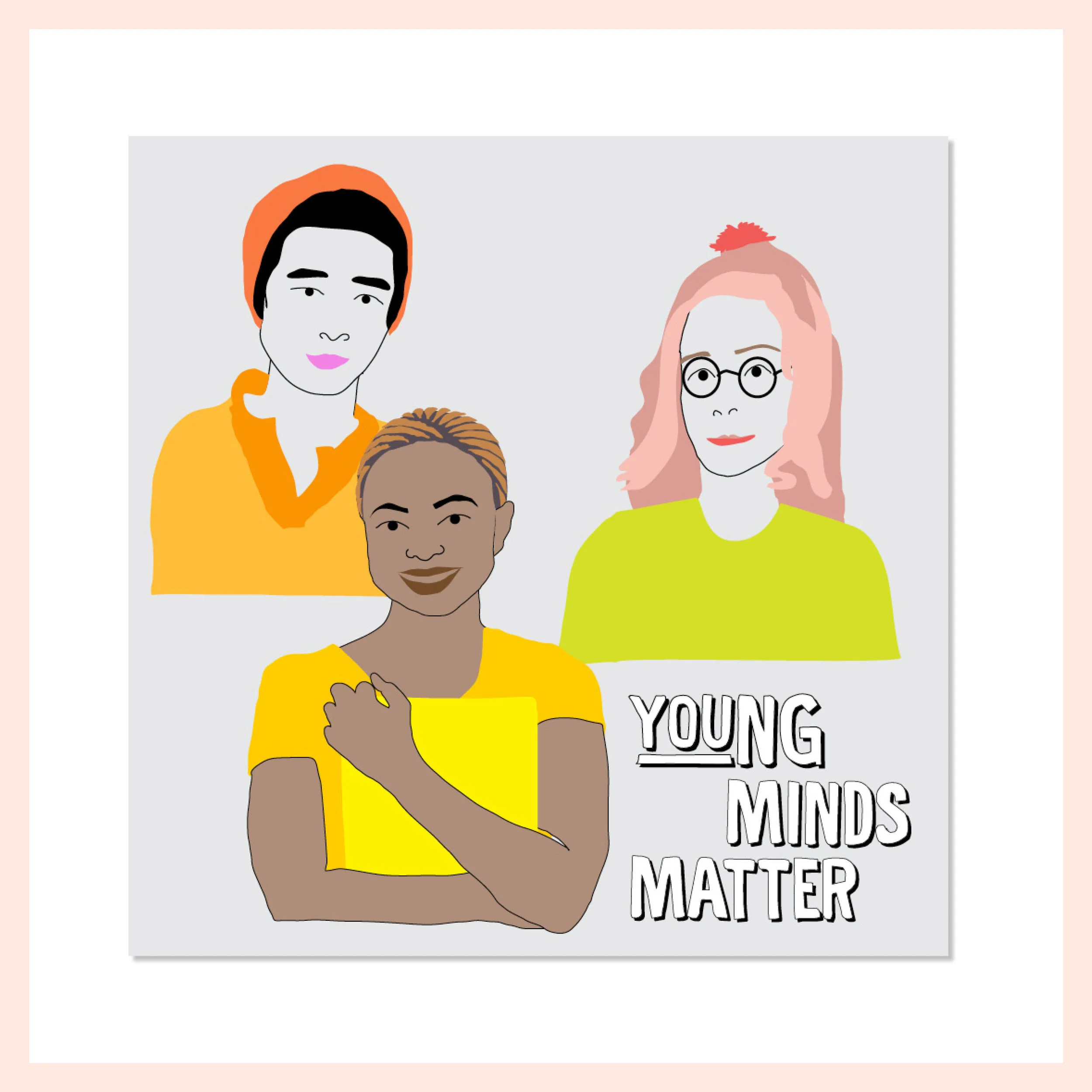
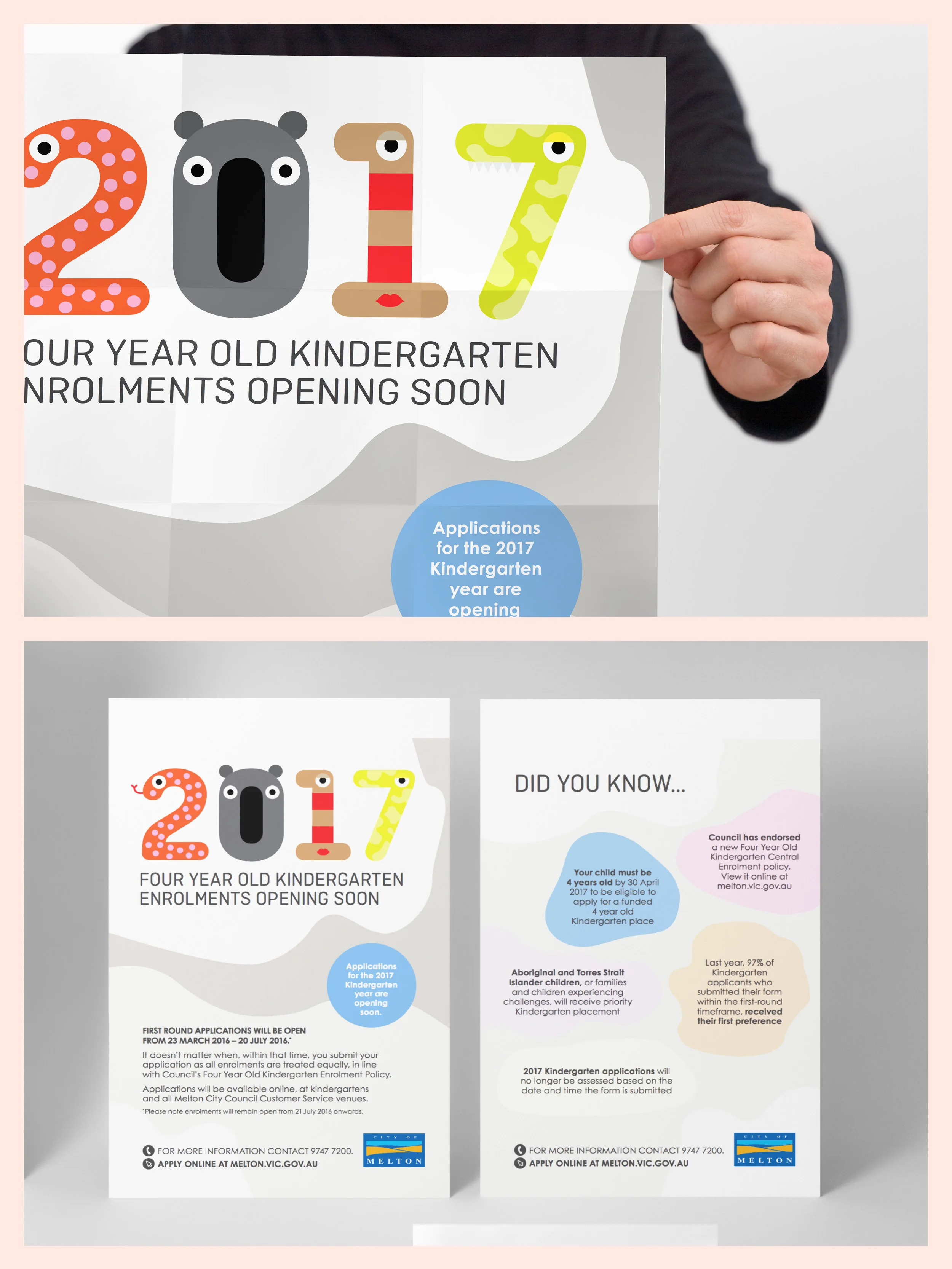
Illustration and design for a project for Melton Council tackling young minds.
Design, infographics and photography direction for the Report. Credit Anna Carlile for the photography.
Logo and visual identity design.
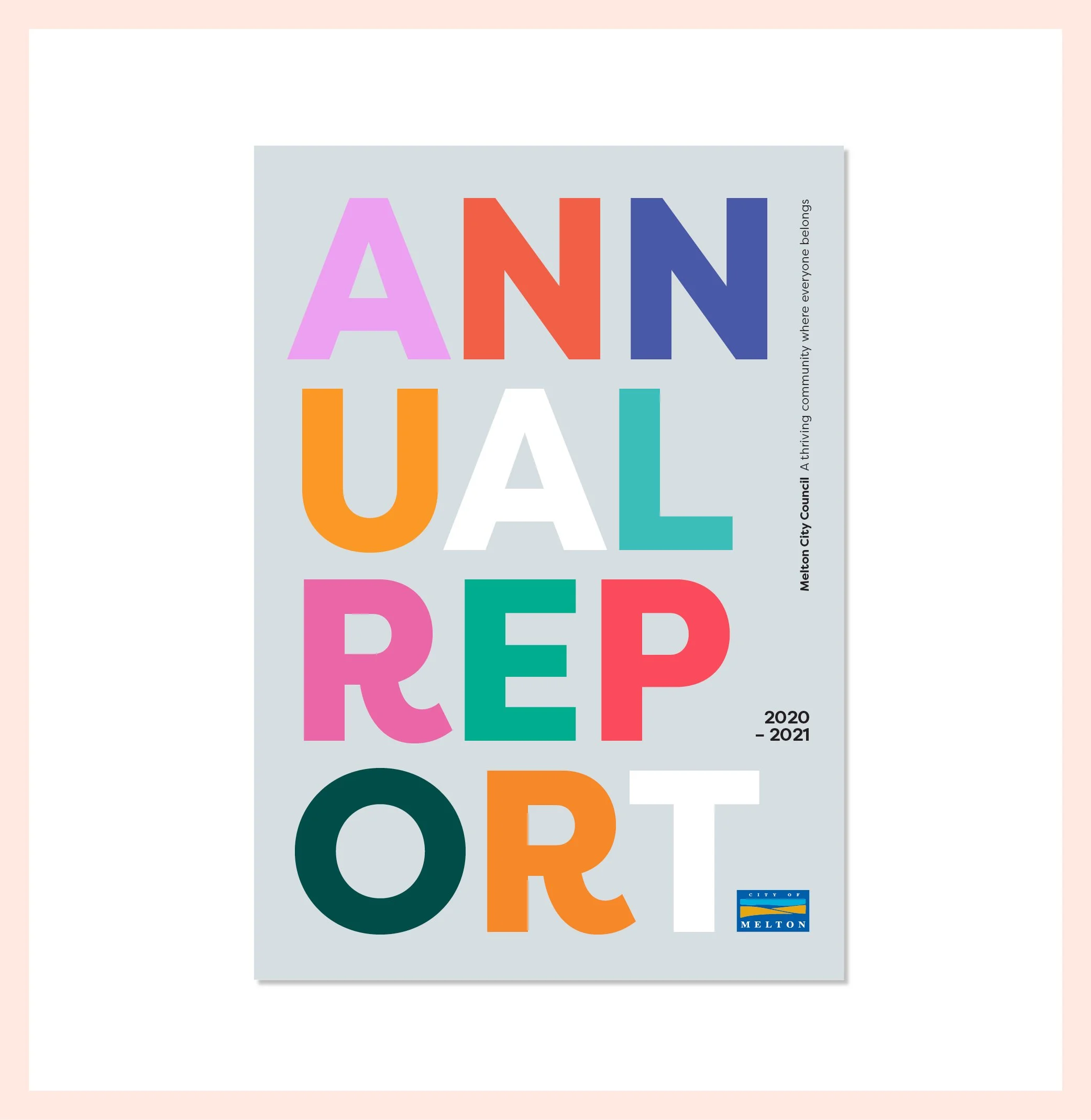
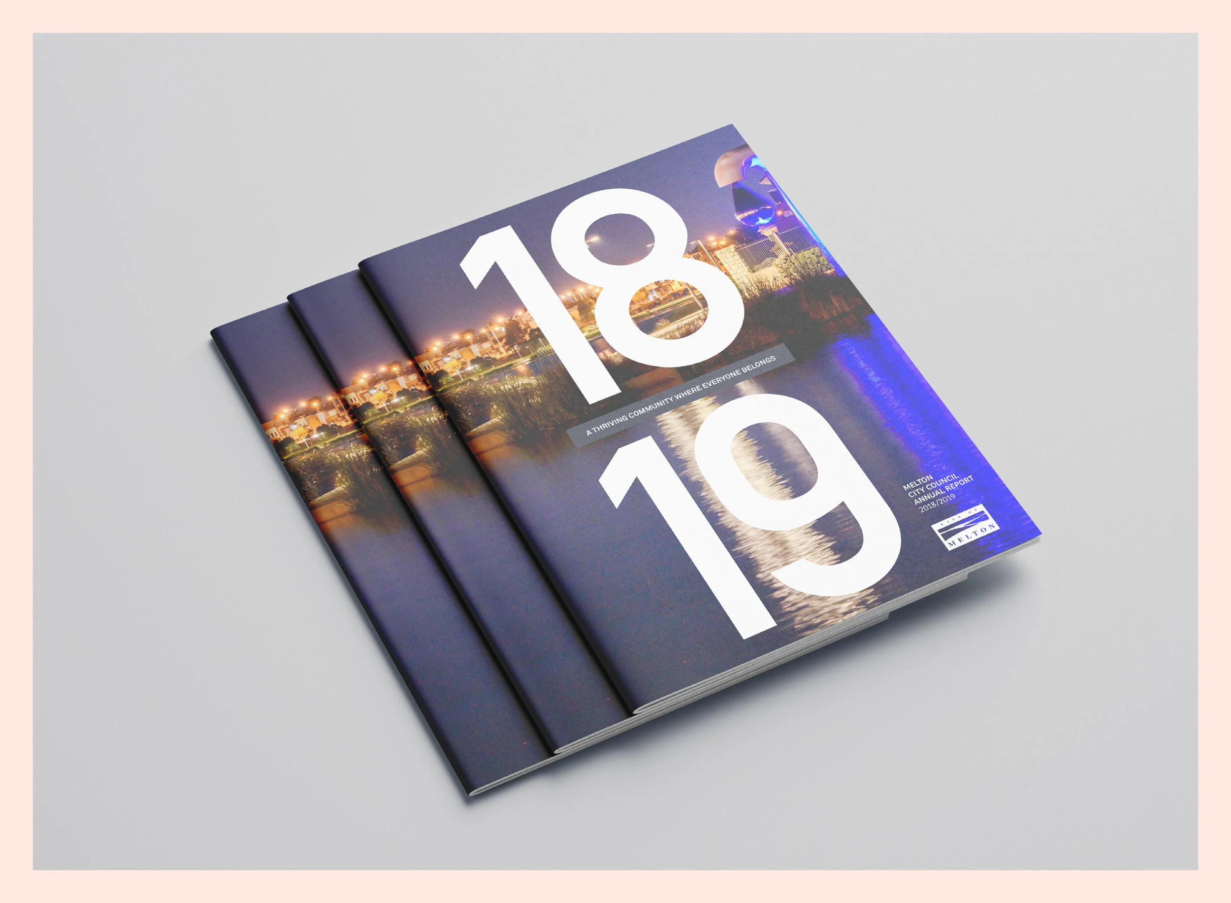
Brand refresh for Melton Council.
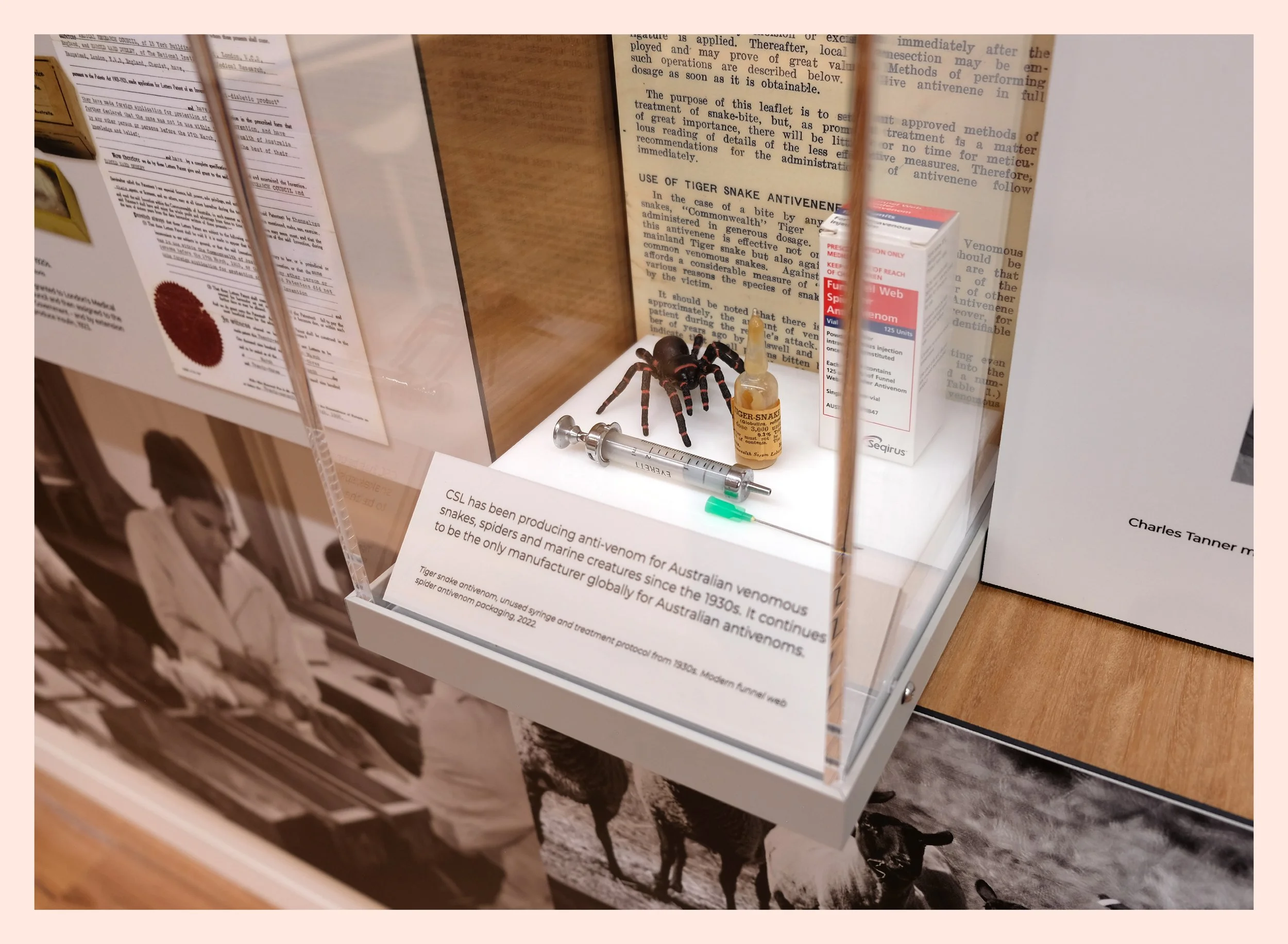
Brochure design for Seqirus.
Banyule Community Health – logo and visual identity for a community program to encourage kids 0–5yrs to pick up books.
We've just completed the new brand design for Melton town centre. This new brand will assist in helping to inspire the people of Melton – creating a platform for Melton Council to work together with the traders in a new and more effective way. Several trader consultation sessions provided the initial direction for us to then go away and develop a strong, flexible and vibrant brand.
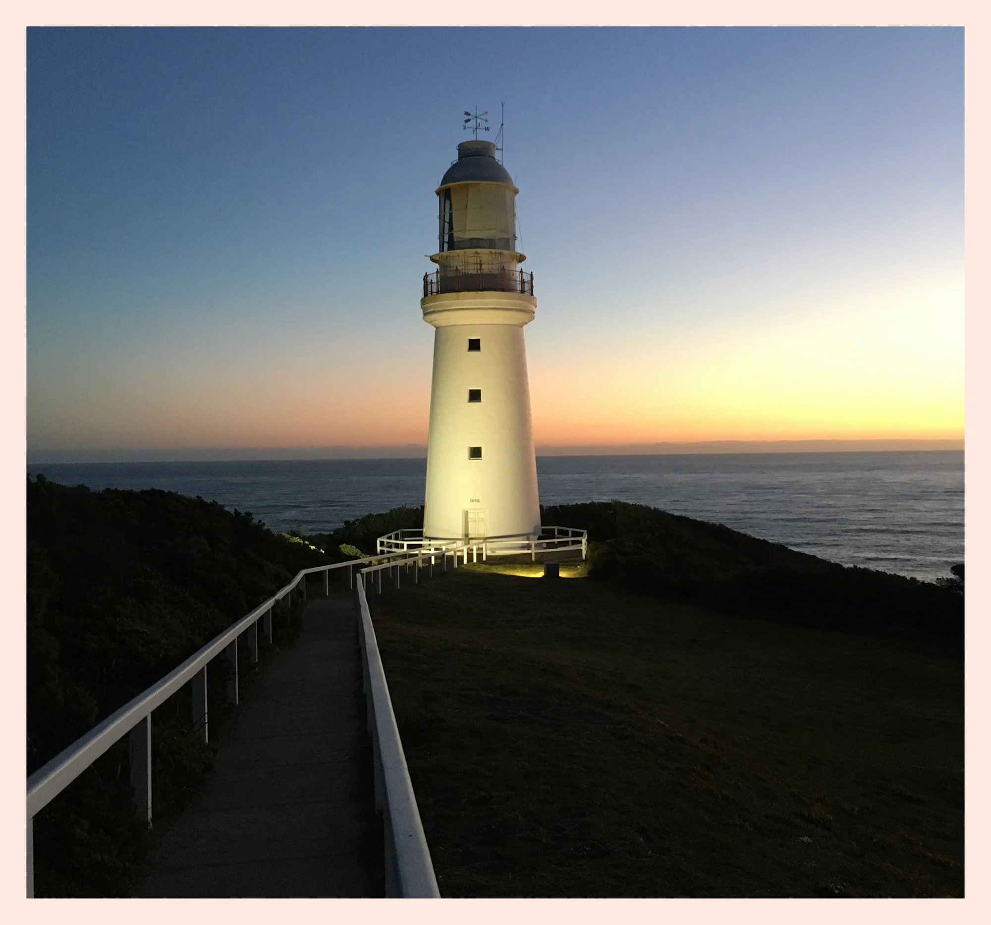
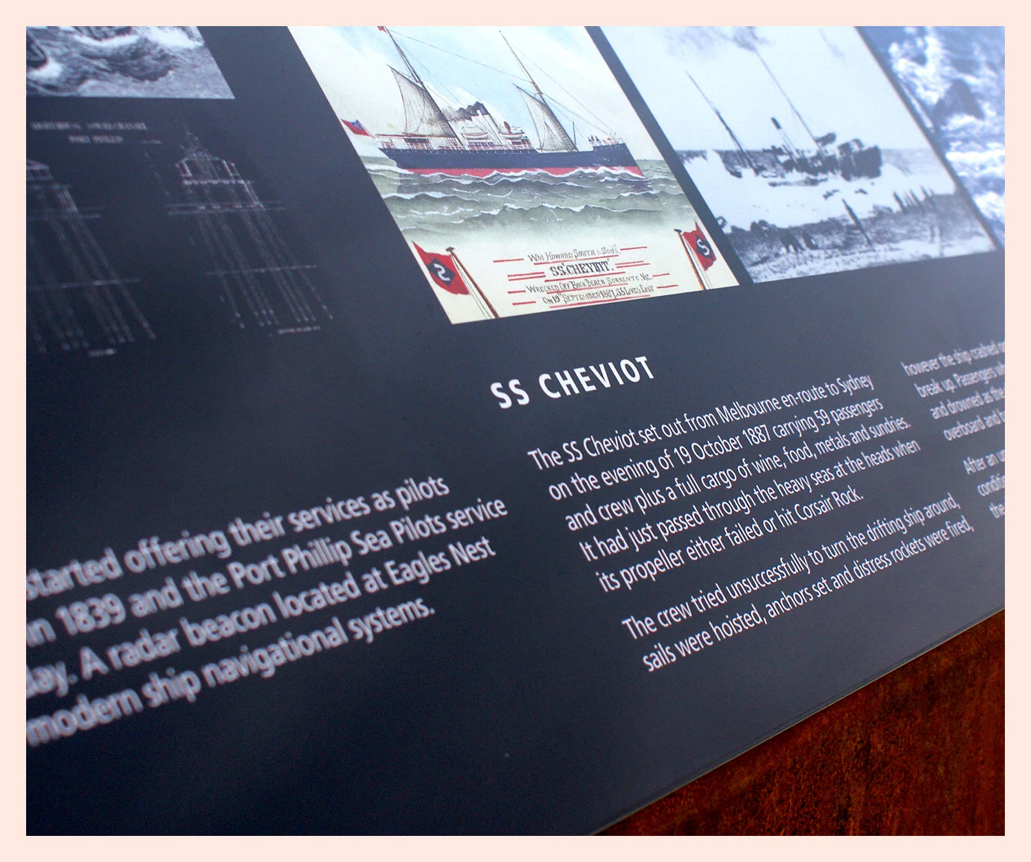
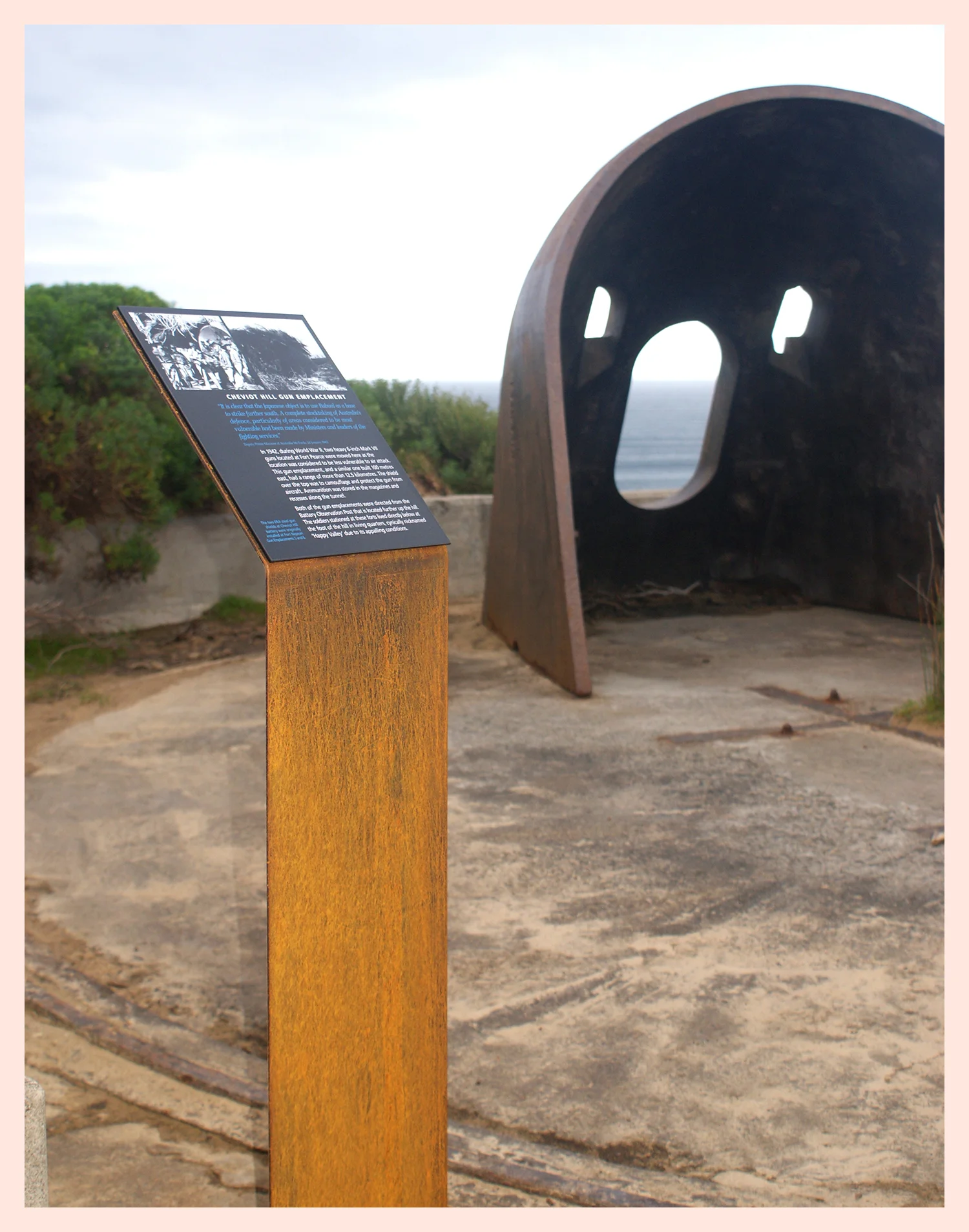
Interpretation and way finding signage for Cape Otway Lightstation. Using a rich navy blue and royal red, we designed a comprehensive suite of signs with a clear hierarchy – leading people through the park while telling them stories.
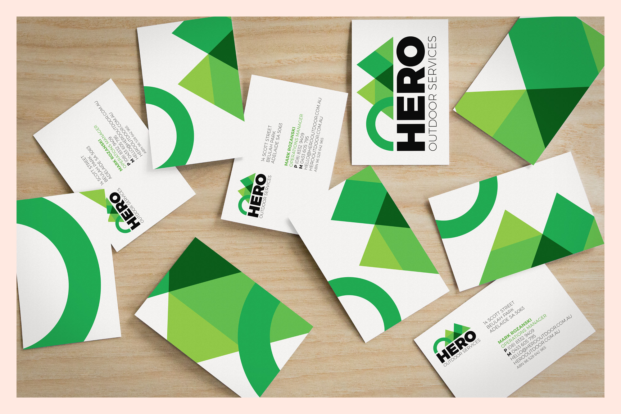
Logo and visual identity design for Hero Outdoor Services – landscaping business based in Adelaide.
Interpretation signage for Langwarrin Flora & Fauna Reserve. Hand crafted typeface for the headings and designed to be complimentary to the job we did at Point Nepean National Park. Langwarrin Flora and Fauna Reserve has had a long and important role in the military history of Victoria and Australia. Established as a Defence Reserve in 1886, 49 hectares of land was cleared of vegetation to allow for military training and encampments of Victorian colonial forces. The men of these colonial forces were part-time soldiers, similar to today’s reservists.
The reserve at Langwarrin was chosen as an ideal location to house prisoners of war in late 1914. The surrounding bush meant the facility remained private and hidden from the local community. The prisoners detained at Langwarrin were German, Austrian and Turkish nationals living in Australia at the outbreak of the First World War. Later in 1915 a hospital complex was established within the reserve to treat Australian soldiers sent home from deployment suffering venereal diseases they had contracted overseas.
Well worth a visit.
Scope
Interpretation Design, Signage System, Soundscapes, Brochures, Collateral
Description
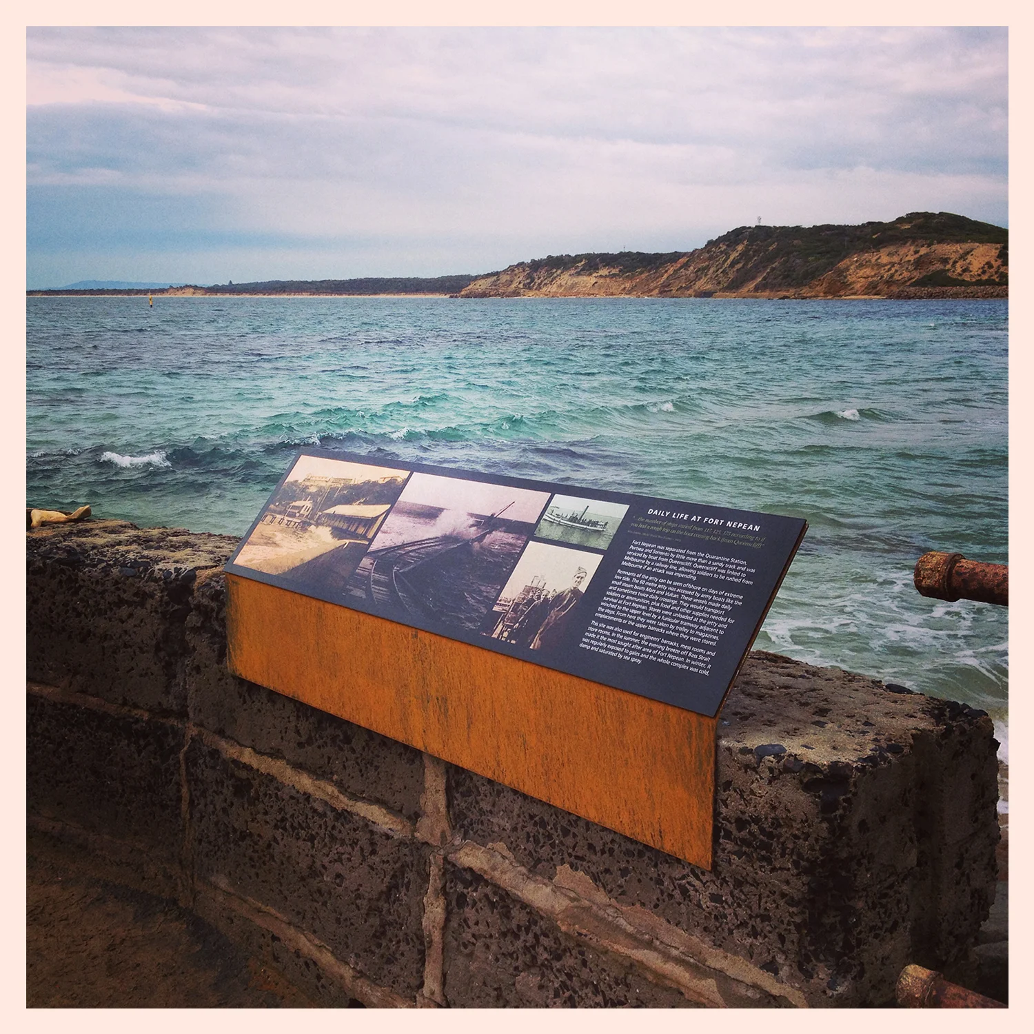
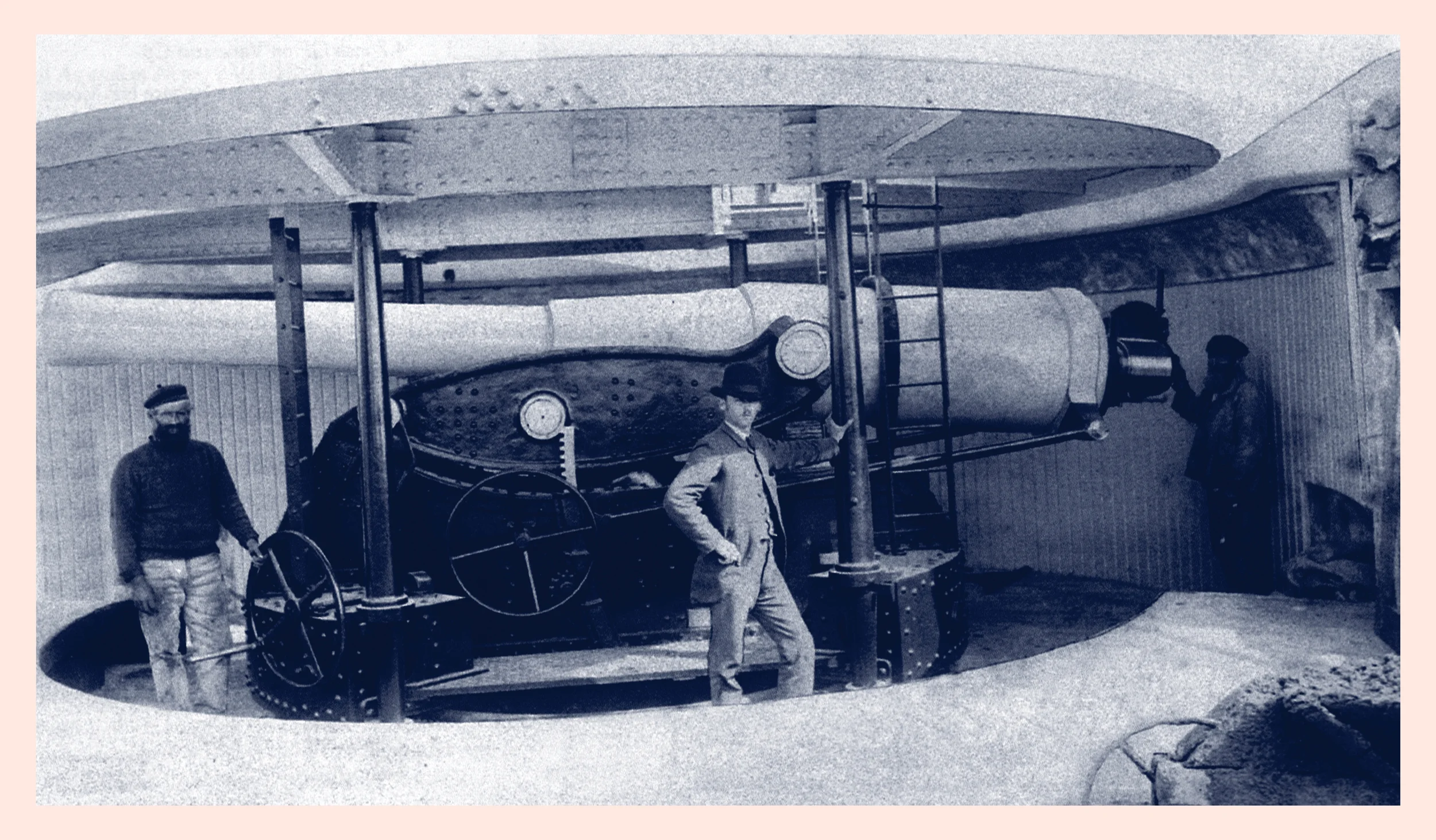
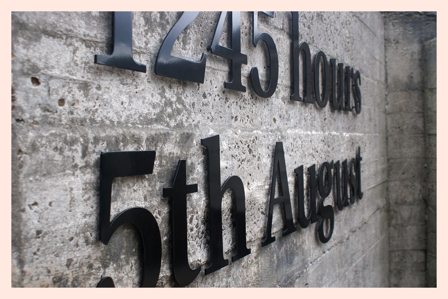
To recognise the ANZAC Centenary, Parks Victoria undertook a significant reinterpretation of the iconic Point Nepean National Park site, Fort Nepean, the location of the historical first shot of the British Empire of World War I.
Through extensive research and consultation we unravelled the stories of this incredible site and these stories are told through the interpretative suite of signage (over 100 signs), motion triggered soundscapes (within the gun emplacements and tunnels), life-size silhouettes of historical figures walking through the park, self-guided brochure. The design sought to focus sensitively on the natural and historical significance of the site so as not to overtake the space and minimise impact on the heritage listed site.
This milestone interpretation project contributes to a combination of on ground conservation, visitor access improvements and public programs at Point Nepean that will provide current and future generations with an enduring connection to the site and its significance to Australia’s military history.
Logo, visual identity and illustration design for Western Gems Tours.
Raising awareness on violence against women. Typographic coffee cups.
Exhibition designer: Studio Mether (studiomether.com)
Design of Journeys exhibition to assist visitors clearly being able to identify that they are entering a new exhibition space within NMA. Through use of bold colour, graphics and hero showcase displays each of the 3 entry/exit points were made obvious.
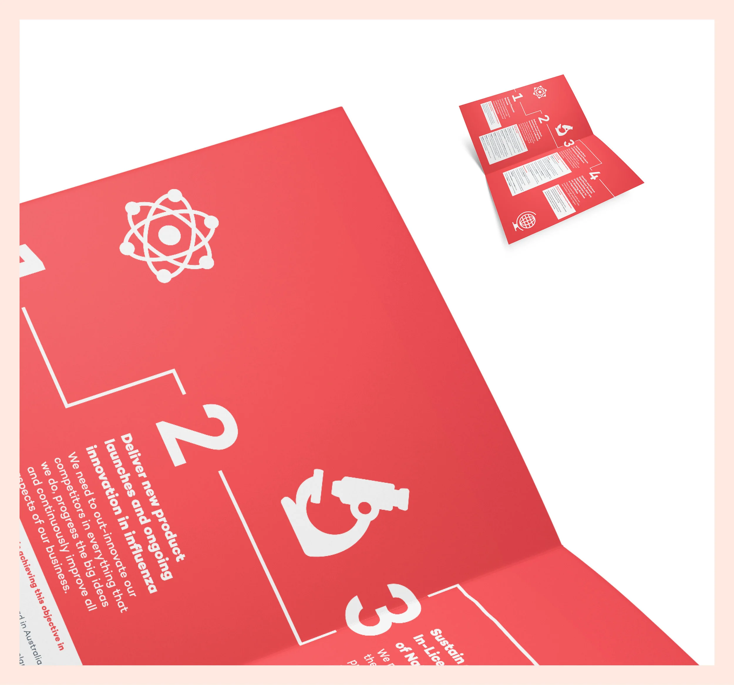
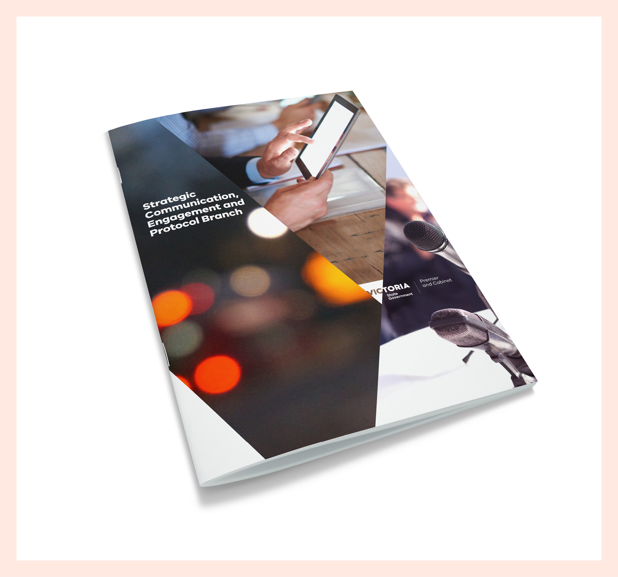
Strategic Communication, Engagement and Protocol Branch 24 page publication with complimentary interactive pdf internal forms.
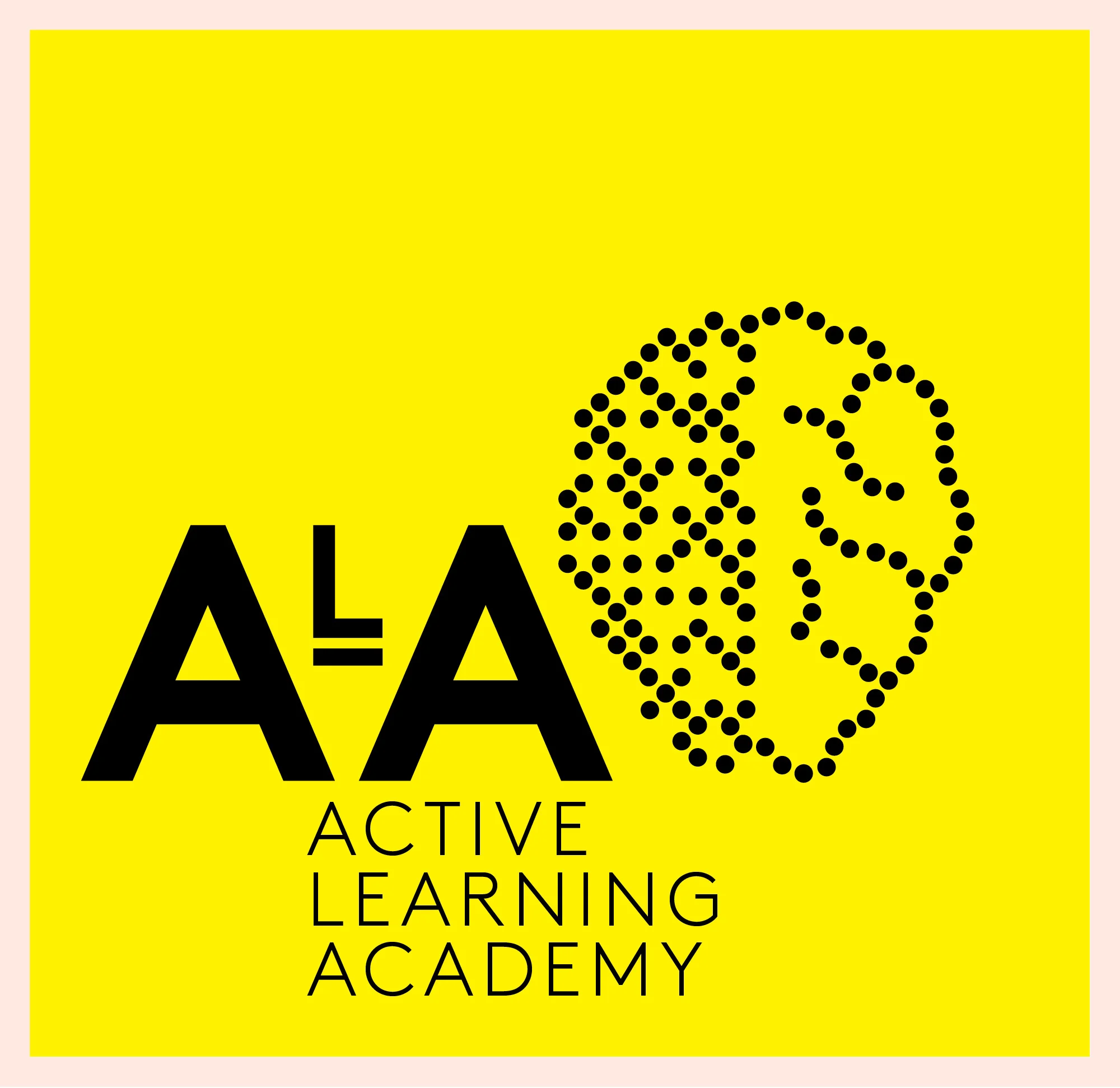
Logo design for Active Learning Academy.
Design of an invitation and brochure for the launch of a new sculpture at the Dandenong Market.
Scope
Interpretation Design, Signage, Collateral
Description
South Channel Fort is an artificial island, built in the 1880s, as a part of the strategic defence network of Port Phillip. To link the island to the Point Nepean National Park, a hierarchy of signage was designed, produced and installed to compliment existing interpretative responses to the park.
Unlocking these fascinating historical stories by the use of sensitive signage and markers allows visitors access to panoramic views over Port Phillip and contributes to the preservation of the important breeding site for the White-faced Storm Petrel and other important birdlife.
Logo design for Health Tracks Wiki.
Scope
Campaign Concept & Name, Branding, Collateral, Advertising
Description
The Ronald McDonald House Charities are among some of the most recognisable not for profit organisations in Australia, justifiably lauded for their commitment to seriously ill children and their families.
The Host a Roast campaign required name, logo, supporting visual identity and various advertising platforms to promote the campaign within established brand guidelines.
The peer-to-peer fundraising model of the campaign began as a family engagement model. The goal was to encourage families with seriously ill children to deepen the interpersonal and family connections that are built through the simple act of sharing a meal, while donating the funds that would have been spent on a lunch out.
Get involved - anyone can host a roast!
Go to hostaroast.org.au
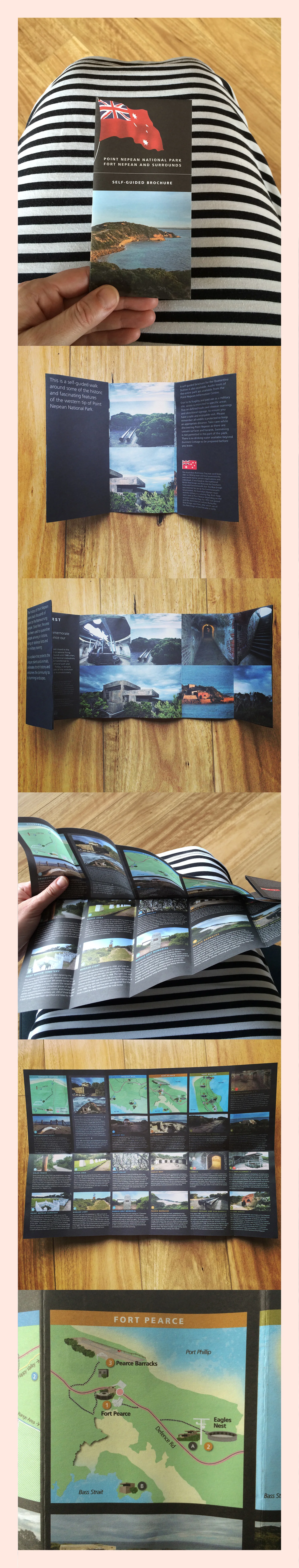
Scope
Brochure
Description
To complement the existing Quarantine Station brochure and as a part of the interpretation design for Fort Nepean, this new self-guided brochure was created to showcase the incredible natural and historical markers of the National Park.
Beautifully realised and perfect for pocket size, the brochure is not only a functional guide to the park, but also an opportunity to layer the interpretation experience for visitors to the park by providing a tangible souvenir of the park.
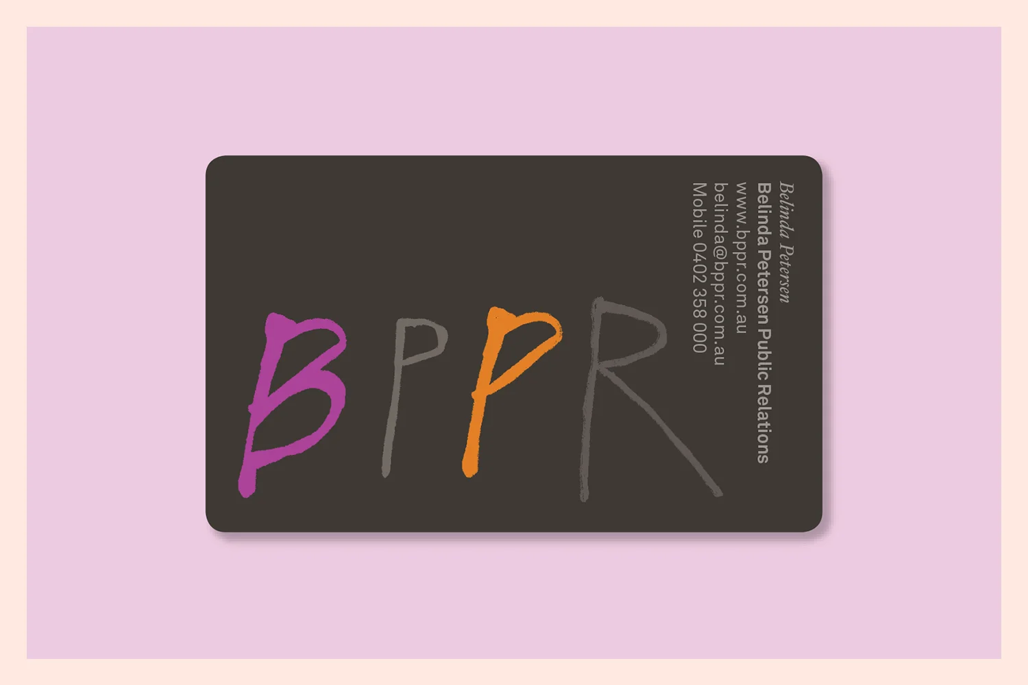
Scope
Logo, Stationery, Visual Identity, Website, Collateral
Description
Belinda Peterson PR specialises in marketing, media, strategy, issues management, events and branding. Her years of experience and energy bring her clients an astute and thoughtful public relations specialist who cares about the details.
The use of embellished print gives this project a lovely tactile finish that reflects this brand personality across all their promotional collateral. With just a little bit of quirk set against the luxury, Belinda's clients know that they're working with someone special.
Scope
Campaign Concept, Visual Identity, Collateral
Description
Hagar Australia is a specialist organisation that works with survivors of slavery and trafficking. Distressingly, Hagar estimates that the price of a slave in 1800 was $40,000 in today's equivalent; in 2014 that figure was $90.
Hagar is committed to the supporting the lives of people who have experienced severe human rights abuses and works through a range of commercial and not for profit entities, and private and public sector partnerships, to achieve this work.
This Christmas appeal drew from illustrations provided by survivors of trafficking, created in art therapy and creative counselling contexts, highlighting the exceptional courage and resilience of those people that Hagar looks to support. Each card was addressed by hand and included a hand written letter from a woman who had experienced trafficking, to ensure that the campaign drew as authentically as possible on the real, lived understanding of this global human rights issue.
We are proud at Studio Tweed to have contributed to this organisation's ability to quadruple the public contributions of their Christmas appeal from the previous year through this work.
Scope
Logo, Visual Identity, Styleguide, Website, Stationery, Collateral, Advertising
Description
To celebrate the launch of this new outdoor film festival, held in the popular beachside destination, Lorne, we worked to create a complete visual identity that spoke immediately to place and the purpose of the event.
Using a black to evoke night (the best time to watch outdoor cinema!), the iconic Lorne Pier and a classic film reel, generated a sleek look for this contemporary festival that looks to engage the community with its dynamic coastal culture and stunning natural environment.
The hand painted, watercolour textures suggest a relaxed ocean feel for a community that is interested in sharing the best that film has to offer and creating a new relationship to place for local and visiting audiences.
Scope
Interpretation Design, Signage, Brochure Dispenser Design, Collateral
Description
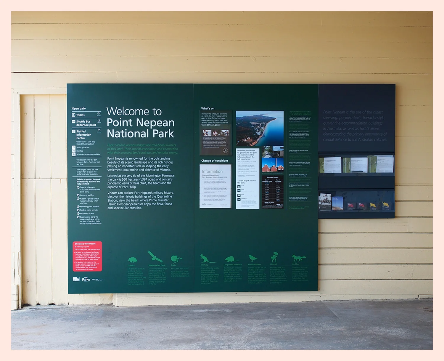
The Point Nepean National Park is one of Victoria's most beautiful natural landscapes, with a rich history in shaping Victoria's early settlement, quarantine and defence.
Located at the very tip of the Mornington Peninsula, with outstanding coastal scenery and panoramic views of Bass Strait, the Rip and Port Phillip Bay, the Stables were recently repurposed as a new information precinct to welcome visitors.
As first point of contact for visitors, this project focused on accessible, engaging and digestible information that cued visitors to the many experiences on offer in the park.
Balancing the logistical (i.e. directions, safety etc) and the historical information with a design that was sympathetic to the natural and built environment, this project gave strong attention to the process of information hierarchy and to accessible, appealing informational design. Special attention was paid to the presentation of information for children, to connect with the next generation of visitors to this very special place.
Scope
Publication Design
Description
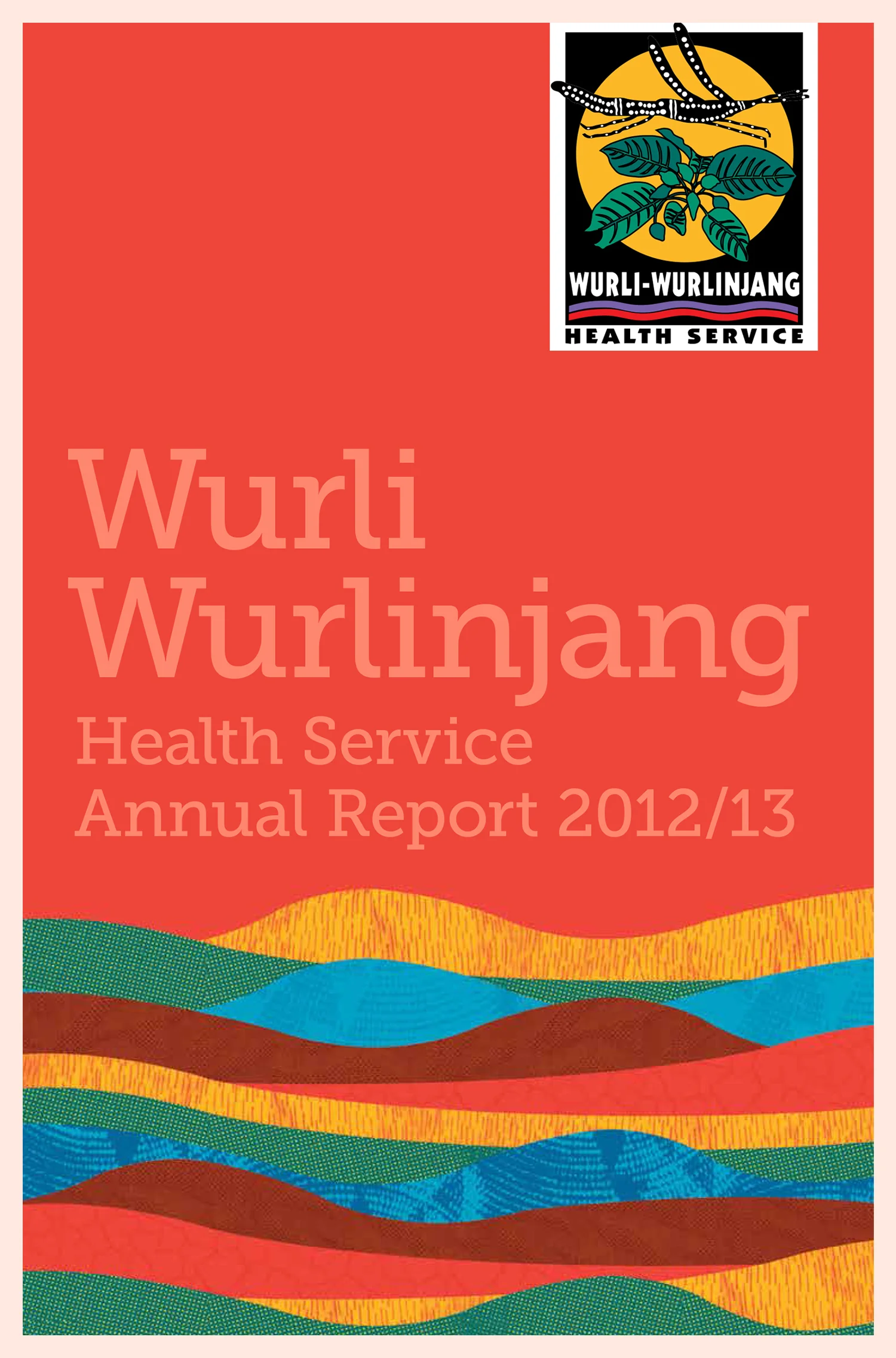
This project was realised in conjunction with Blackwattle Consulting (who specialise in working with Aboriginal communities, mostly in the health, child and family, and disability sectors).
Wurli Wurlinjang provides comprehensive primary health care to Aboriginal and Torres Straight Islander people in the Katherine region. Their Annual Report plays a significant role in sharing the successes and challenges of the organisation's work, and connecting to the community that it is a part of and seeks to support.
This Annual Report drew on the organisation, the environment and its cultures. The Jawoyn people of the Katherine region recognise five major seasons, which play a significant part in moulding the culture of the area, and were used as a primary inspiration in the textures and colours used within the report.
Scope
Publication Deisgn
Description
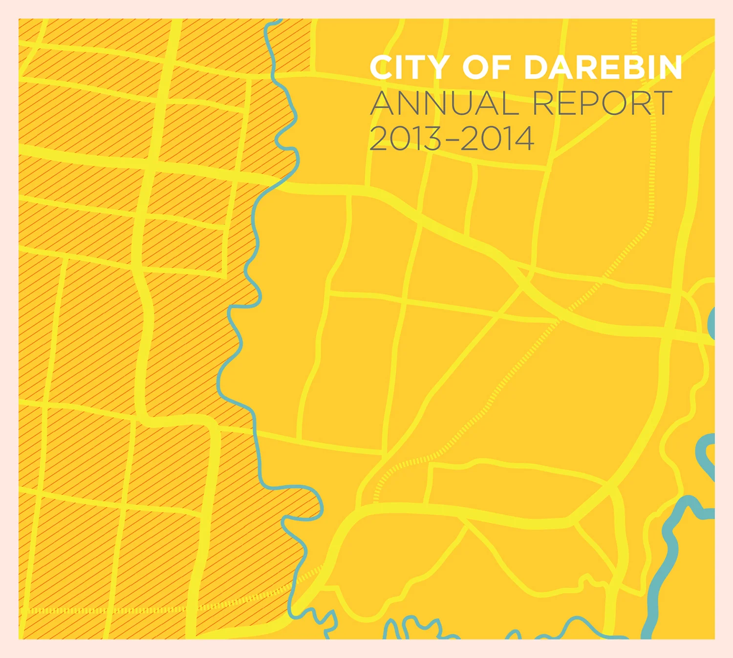
City of Darebin is an incredible community that is in an exciting phase of change and growth. Sharing the achievements, challenges and future direction of the council is, therefore, no simple task.
At almost 300 pages, the City of Darebin Annual Report needs to guide its audience through a large amount of information in ways that are accessible, appealing and demonstrate the council's underlying commitment and responsibility to share information with the community to which it is accountable.
Each page was carefully designed to not only guide the reader through the information with ease, but also to reflect the diversity and uniqueness that is the Darebin area. Readers were assisted through engaging photography, thoughtful layout and text spacing, graphs and infographics, and physical tab navigation, all of which greatly enhanced the publications readability.
Scope
Visual Identity, Website
Description
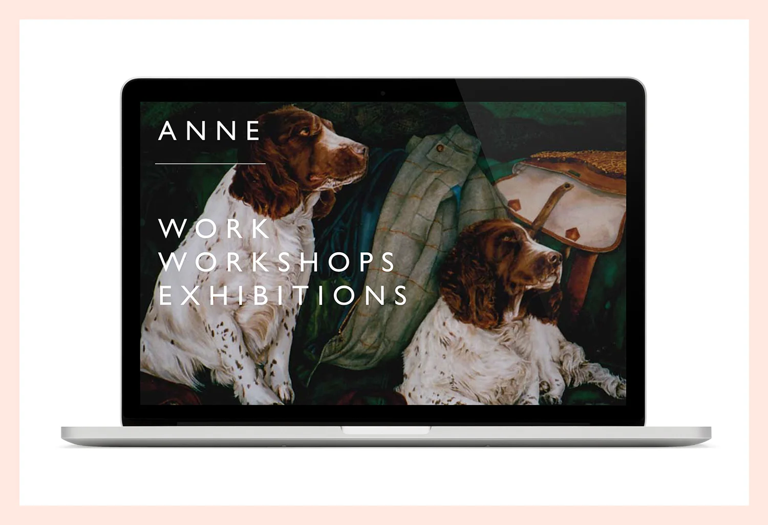
Anne is an Australian visual artist who creates large scale watercolour and pencil artworks, notable for their colour, realism and tenderness towards the subject.
Creating a website and identity that would completely foreground the work was a way of honouring Anne's commitment to her craft. Rather than using excessive additional graphics or other visual elements, we worked to create a platform that acted as a beautiful virtual gallery, guiding the viewer to best experience the work.
Scope
Publication Design
Description
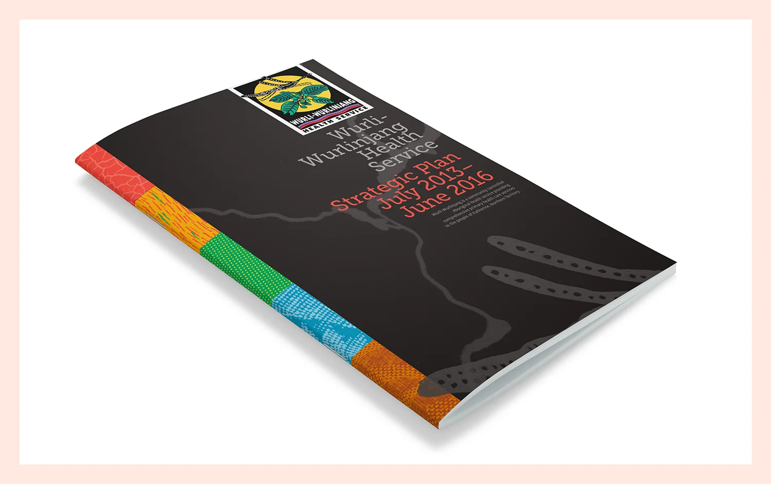
This project was realised in conjunction with Blackwattle Consulting (who specialise in working with Aboriginal communities, mostly in the health, child and family, and disability sectors).
Drawing inspiration from the river that defines that region, and using rich photographs, hand drawn illustrations, and watermark effects, this Strategic Plan demonstrated the energy, drive and commitment of this health service to support its community, now and in the future.
Easy navigation and colour-coded tabs drew from the Katherine's five unique seasons and focused this report on ease of reader access to the information contained within.
Scope
Poster design
Description
BIBA has been playing a leading role in the Australian hairdressing industry for over thirty years now, with a continued energy and vigour for providing clients with the best service, freshest looks and superlative care in hairdressing.
The BIBA Academies are a training ground for some of Australia's best qualified and skilled hairdressers.
Working to reflect the BIBA brand and to let the hair shine (no pun intended!) called for a clean, slick design that could be displayed in store fronts to let potential trainees know about the accredited, recognised and high-quality standards of training that BIBA is renowned for.
Scope
Publication Design
Description
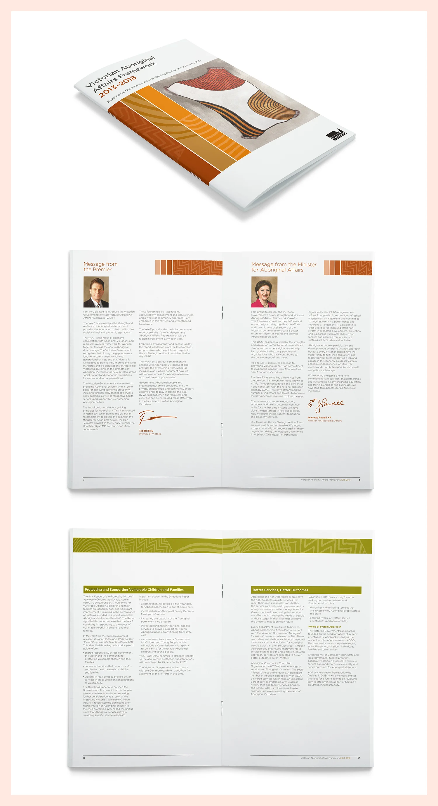
This project was realised in conjunction with Blackwattle Consulting (who specialise in working with Aboriginal communities, mostly in the health, child and family, and disability sectors).
The framework was develop by the former Victorian Government and represented Government and Aboriginal community commitments and efforts to create a better future for Victoria's Aboriginal population.
The striking image on the front cover is part of larger piece by the artist and Taungurung Elder, Mick Harding, and depicts Aboriginal participation in and development of the Victorian economy.
The colour palette and associated visual elements of the framework were all created to be sympathetic to and integrated with Mick Harding's work, while focusing on the accessibility and clarity of the information presented within.
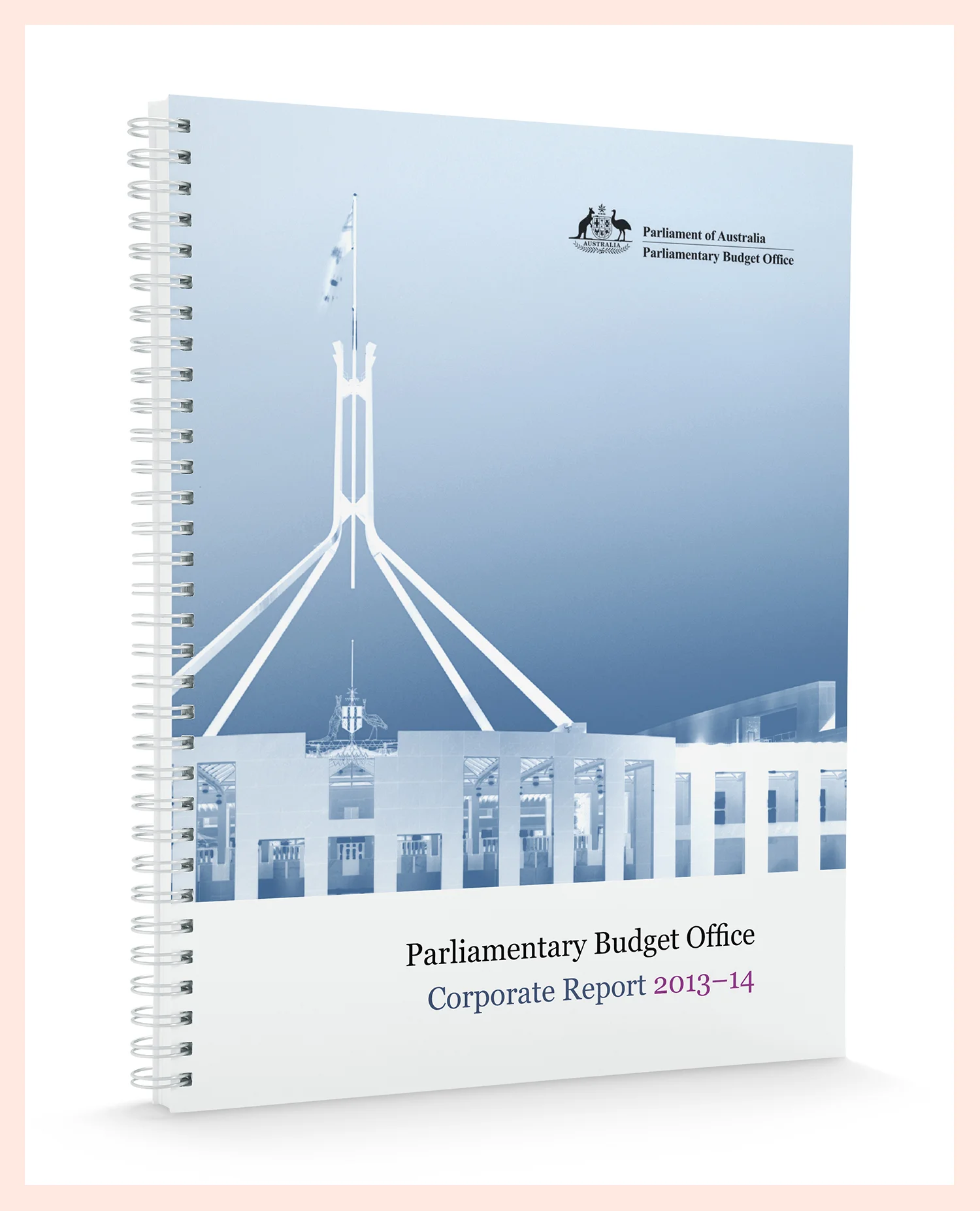
Scope
Publication Deisgn
Description
The role of the Parliamentary Budget Office is to inform Parliament by providing independent and non-partisan analysis of the budget cycle, fiscal policy and the financial implications budget proposals.
Given the serious nature of the agency's work, this report required exceptional attention to detail to ensure exact compliance with the established visual identity and guidelines. Designing these Corporate and Research Reports was driven by the agency's commitment to neutrality, professionalism and information at the highest levels.
The report design was then translated into a Word template to assist staff at the agency to produce corporate and research materials at that same high standard.
Scope
Event Identity, Posters, Stationery, Collateral
Description
Music Victoria is the independent voice of the Victorian contemporary music industry. Working with artists and producers from an incredible range of practices, Music Victoria looks to support and drive music throughout Victoria.
Music Victoria are passionate about what they do, and that love affair with music, the energy and drive of the organisation, are palpable in all of their visual representations.
By always keeping text and information clear, the visual messages of Music Victoria are as focused, professional and committed as they are in their work.
Scope
Logo, Style Guide
Description
As a leading agency for writers, artists and thinkers, Booked Out lets the storytellers speak for themselves. With their roots firmly planted in the Australian literary landscape, Booked Out has long-established connections with all the major and independent publishers and can count some of Australia's most popular authors among their friends and colleagues.
This design, which set the tone for the agency's digital and print media, represents an independent, trusted agency that values clarity and invites us all to "read on".
If you're up for story time, you can find Booked Out at bookedout.com.au
Scope
Logo, Visual Identity, Collateral, Stationery
Description
Finding a solution for this multi-disciplinary portfolio professional was an exciting typographical challenge.
Central to the logo was the desire to showcase a design and thinking professional – a professional with a multitude of skills to build creative solutions.
Scope
Interpretation Design, Public Artwork
Description
Created in collaboration with Greenhatch & Partners, and commissioned artists Judy Nicholson and Jamie Symon, this artwork explores the historical and contemporary cultural significance of the Victoria Park site.
Strata of Memory traces the history of the site from the Wurundjeri people’s past and present connection to the land through to the early development of the suburb and the oval, the birth of the Collingwood Football Club and the evolution of Victoria Park as the heart of the local community.
In collaboration with Aboriginal artists Judy Nicholson and James Symon, a large component of the work tells a story of connection to Country, life by the Yarra River in the Dreamtime for the Wurundjeri tribe and the coming together of the Kulin clans to play the traditional game of marngrook.
Incorporating traditional timeline typography with recessed dates and brass plaques, the sand-blasted and dyed concrete is a lasting reminder of the sense of place of this beloved community site.
Scope
Logo, Visual Identity, Stationery, Collateral
Description
Hook in Eye was a boutique theatre productions company known for its sharp wit and intense focus, a company that knew plays didn't just grow on trees.
Using hand painted text and a hand drawn logo, this handsome project was based on classic monochrome palate to elicit a standing ovation that reminds us of the hook that brings all great stories to life.
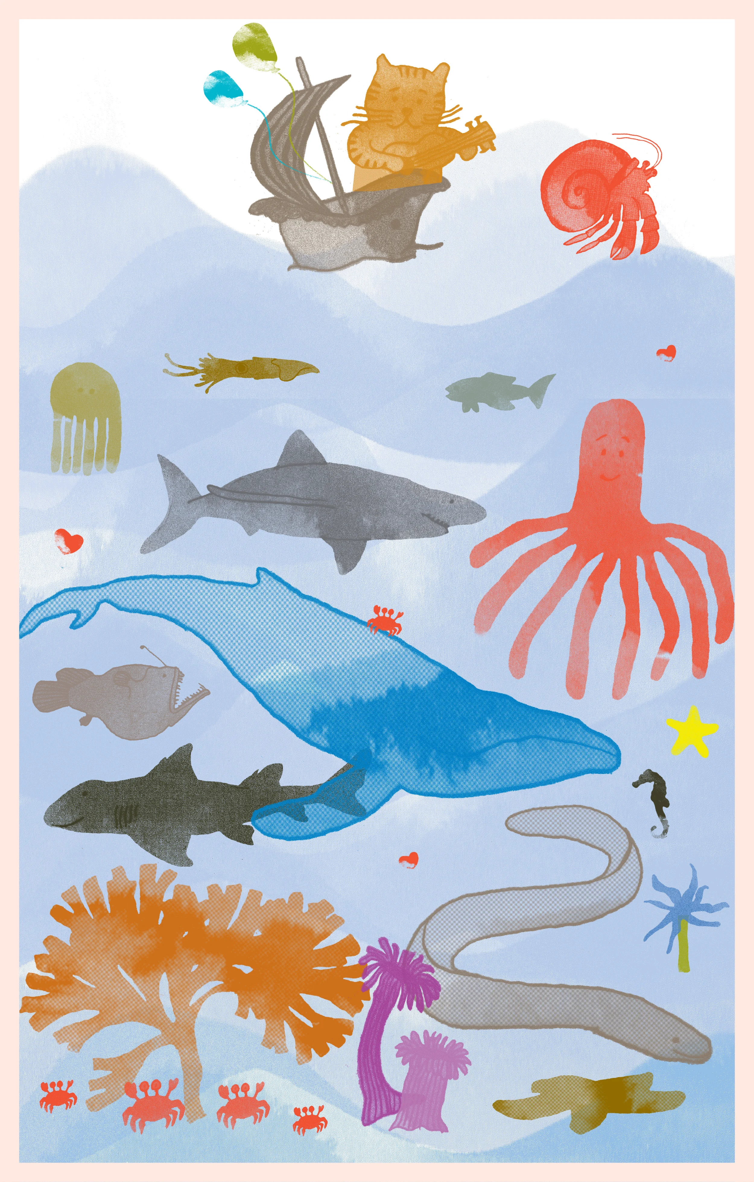
Scope
Illustration, Layout, Stationery
Description
Childhood is a place of great, natural visual imagination - who can forget the magic of a child's drawing, coupled with the fantastic retelling of just what incredible creature is at play in the illustration?
Trying to harness that playful delight with the visual refinement of adulthood, this series of hand illustrated children's cards and invitations uses playful colour and form to conjure the wonder sparked by the natural world, particularly the mysteries of the sea.
Scope
Logo, Visual Identity, Stationery
Description
The Melbourne Poetry Map was a poetic response to the central business district of Melbourne, supported by the City of Melbourne under its arts programs.
Commissioning over 30 writers and poets to create site-specific audio works about the city, the Melbourne Poetry Map needed a suitably tender response to its project, which focused on intimate stories, human connection and "audio graffiti".
Central in the logo is the delicate humanity of hand-painted letterforms, painted with a glass brush and ink – the glass nib allowing a very fine stroke that reflected the nature of the project.
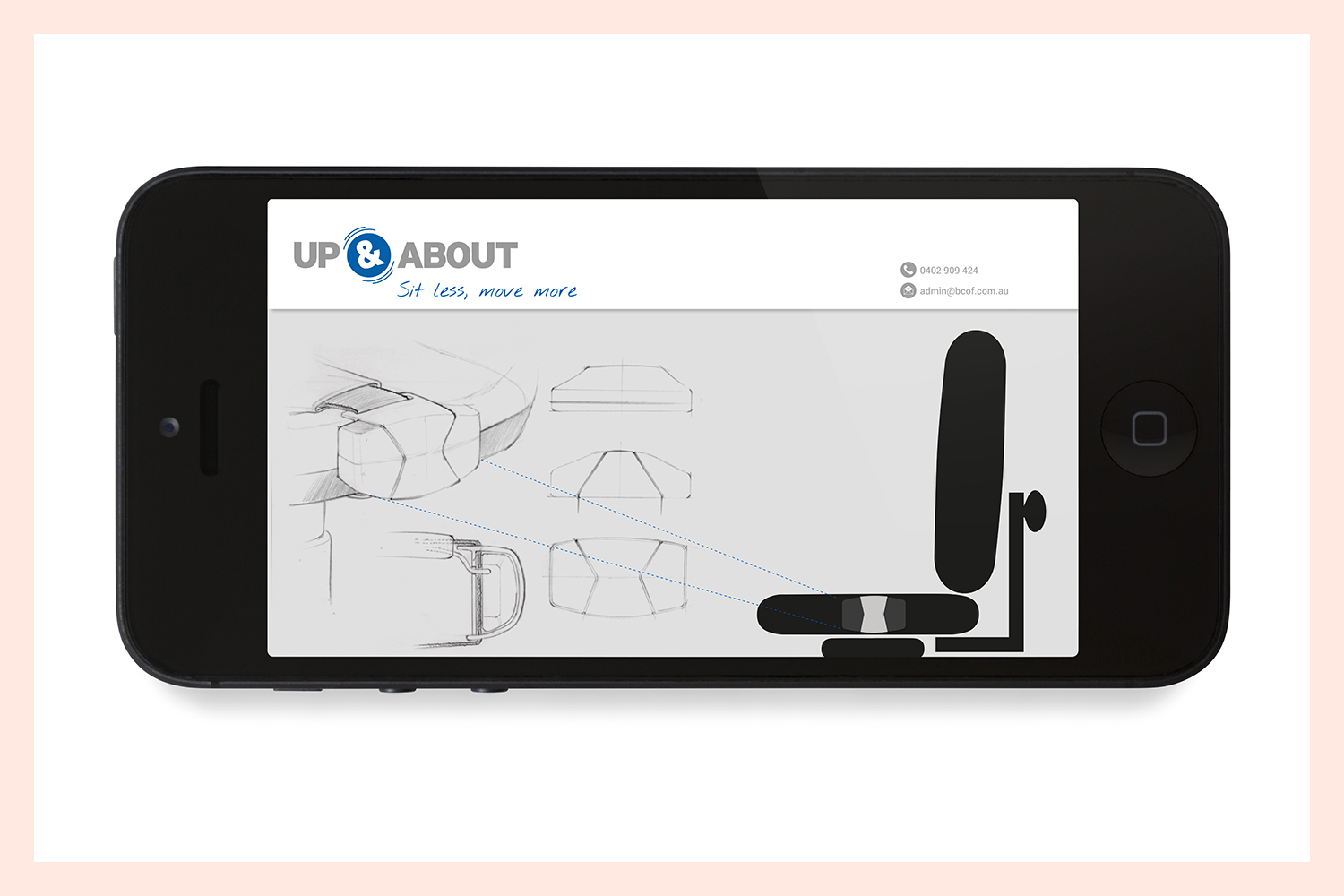
Scope
Logo, Visual Identity, Style Guide, Website
Description
This talented team at Up & About have put their heads together to find a solution to one of the most important emerging public health and occupational health issues: sitting. Prolonged workplace sitting has been described by some health professionals as "the new smoking", given the serious health implications of contemporary sedentary work practices.
With a focus on simplicity and movement, this design speaks to office workers and professionals who need encouragement to get active – reflecting the clear thinking and straight talking of the Up & About team.
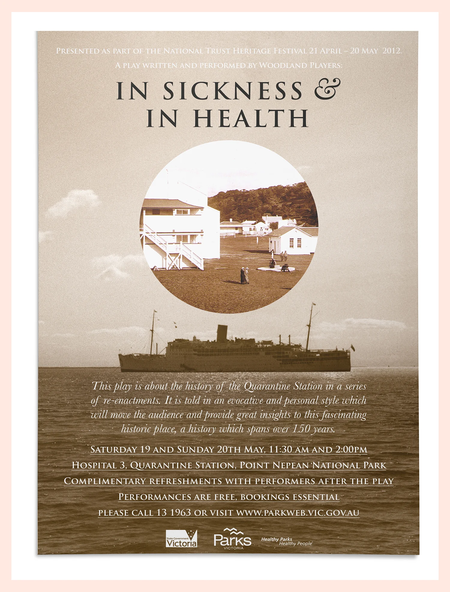
Scope
Poster Design
Description
The National Trust Heritage Festival celebrates the journeys and stories of Australia in all their diverse forms, but particularly through sites and locations of historical significance. As a part of this festival, this production of the play, In Sickness & in Health, showcased the early story of the Point Nepean Quarantine Station.
To capture the time of the early 1900s Quarantine Station and the maritime location of the play's setting, images from archives were incorporated into a formal, nostalgic palette inspired by the photographs, which invited audiences to focus their view on an often forgotten era of Victoria's history.
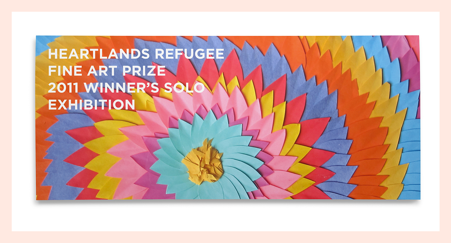
Scope
Flyer design
Description
The Heartlands Refugee Art Prize, held at Point Nepean National Park, celebrates the contribution of refugee artists who have arrived in Australia since 1970. Now in its fourth year, this unique art prize showcases the creative talent and social contribution of visual artists from a refugee background.
Incorporating simple text elements against a hand crafted art piece, the flyer speaks to the human resilience, hope and creativity that is honoured in the prize.